
Project Overview
GCO Partners (formerly Gold City Offshoring) is undertaking a master brand refresh to better reflect an expanded, people-first integrated talent offering across audit/accounting, legal, media, and more. The current identity and “offshoring” language no longer align with the company’s evolved positioning, so this project will define a clearer, more premium, and partnership-led brand expression.
Project Outcome
Two distinct brand identity concept directions:
Evolutionary — a modernized continuation of existing brand equity (logo structure, typography, and/or palette) that signals maturity and growth.
Revolutionary — a fresh, future-facing identity system that supports broader capabilities and a global, integrated partner narrative.
Concept-level guidance that is adaptable across digital and physical touchpoints (website, LinkedIn, email, print, signage), with a clean, modern, credible visual style.
A recommended direction (or clear criteria to choose) aligned to the messaging pillars: reliable integrated talent, smart scale, and people-first partnership.
My Role
• Visual Design Language
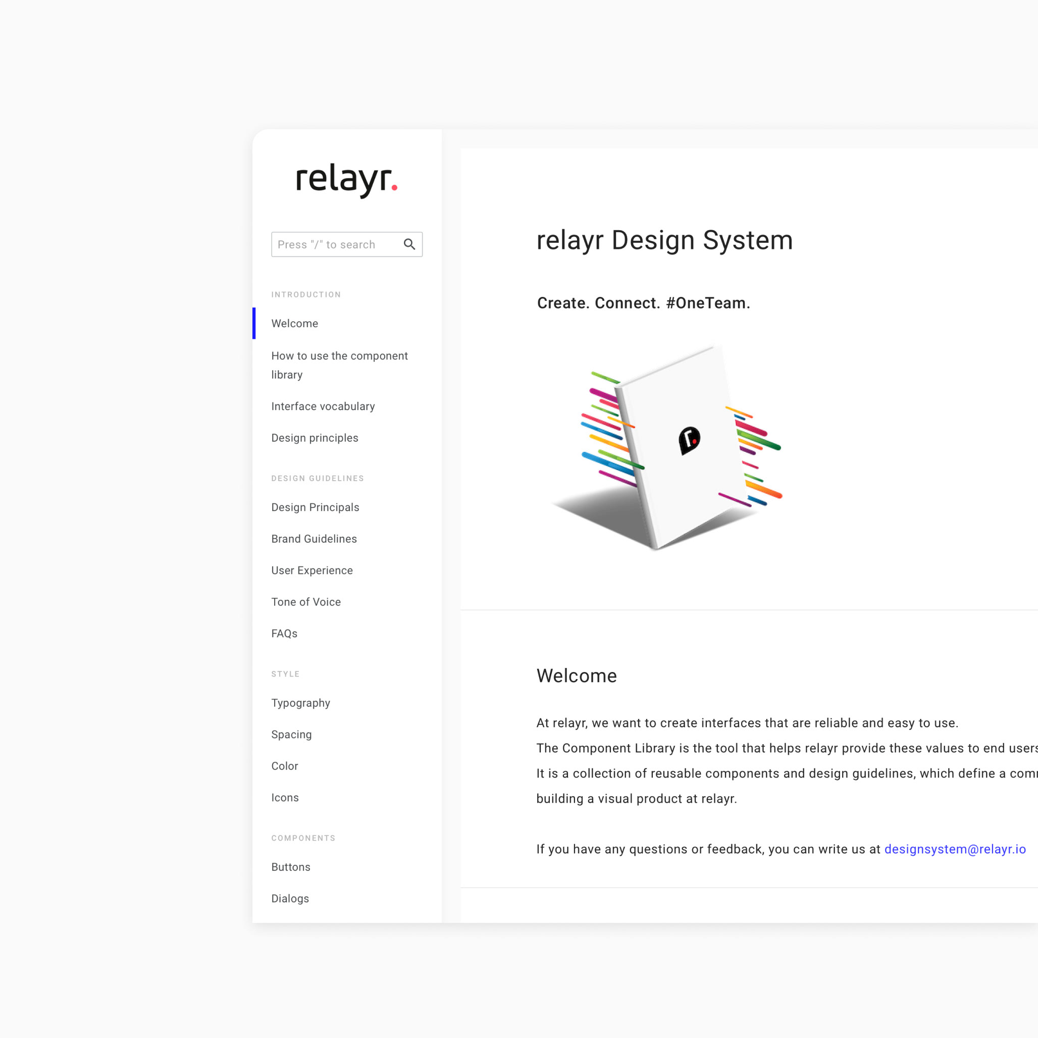
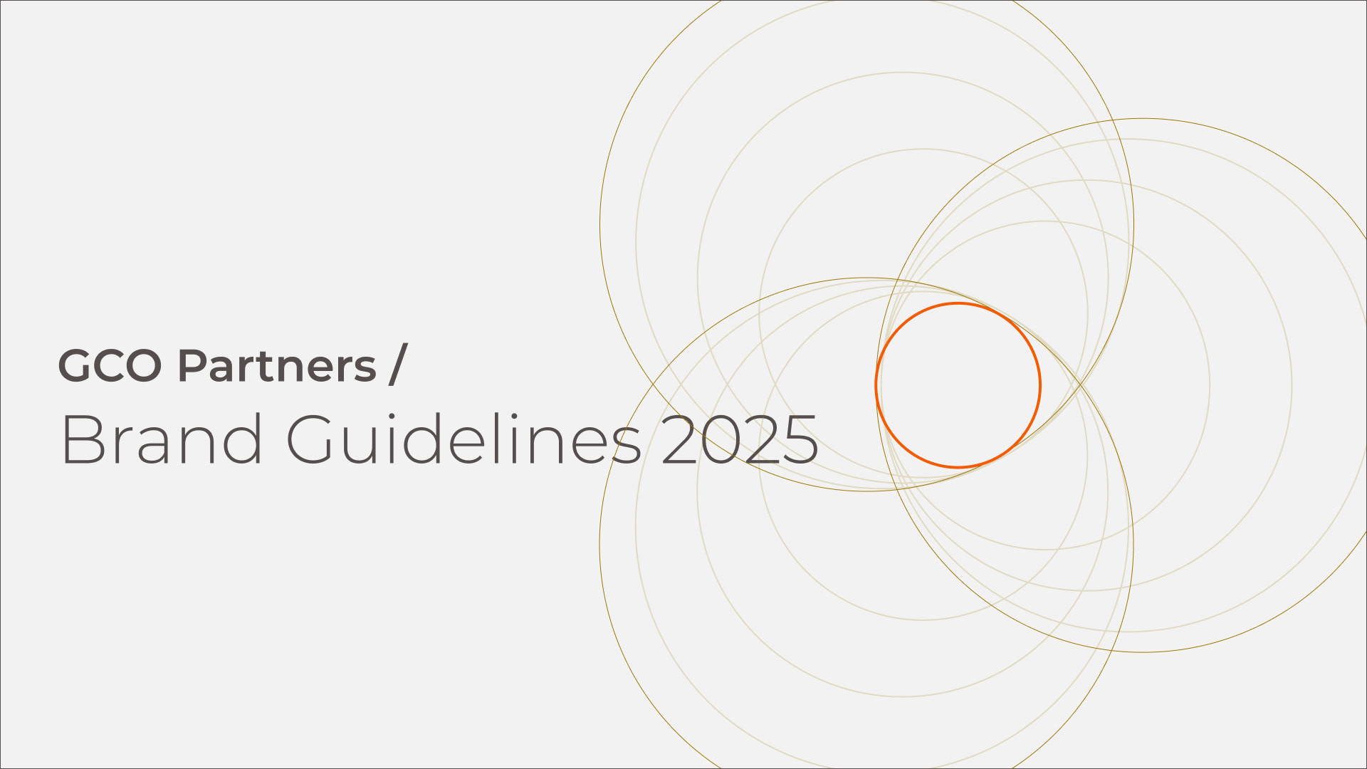
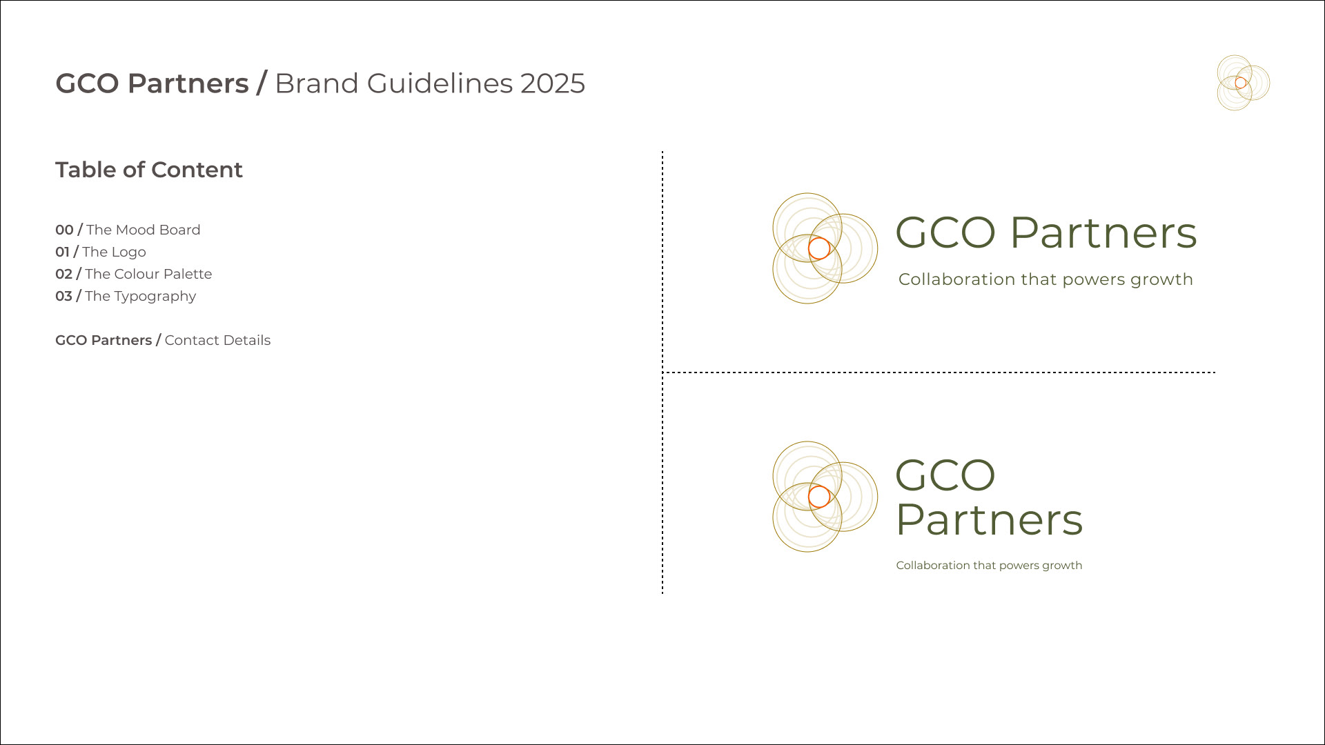
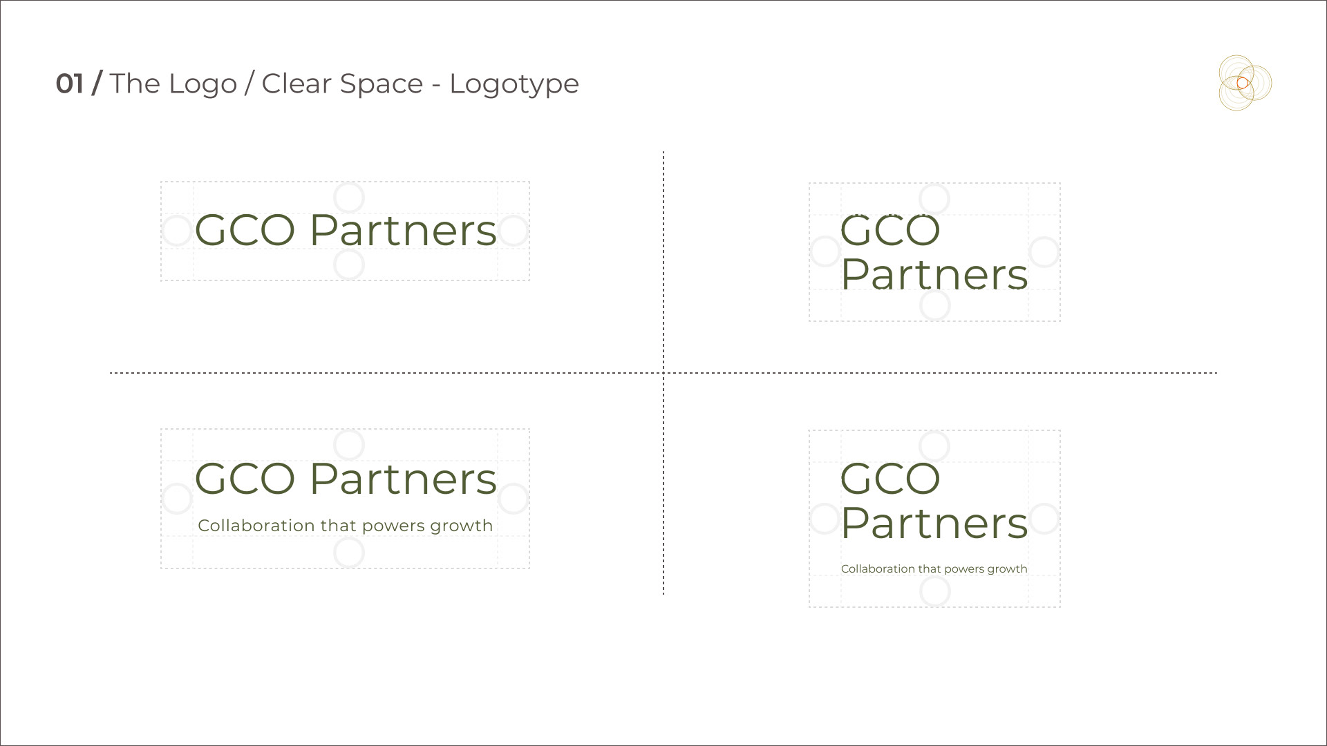
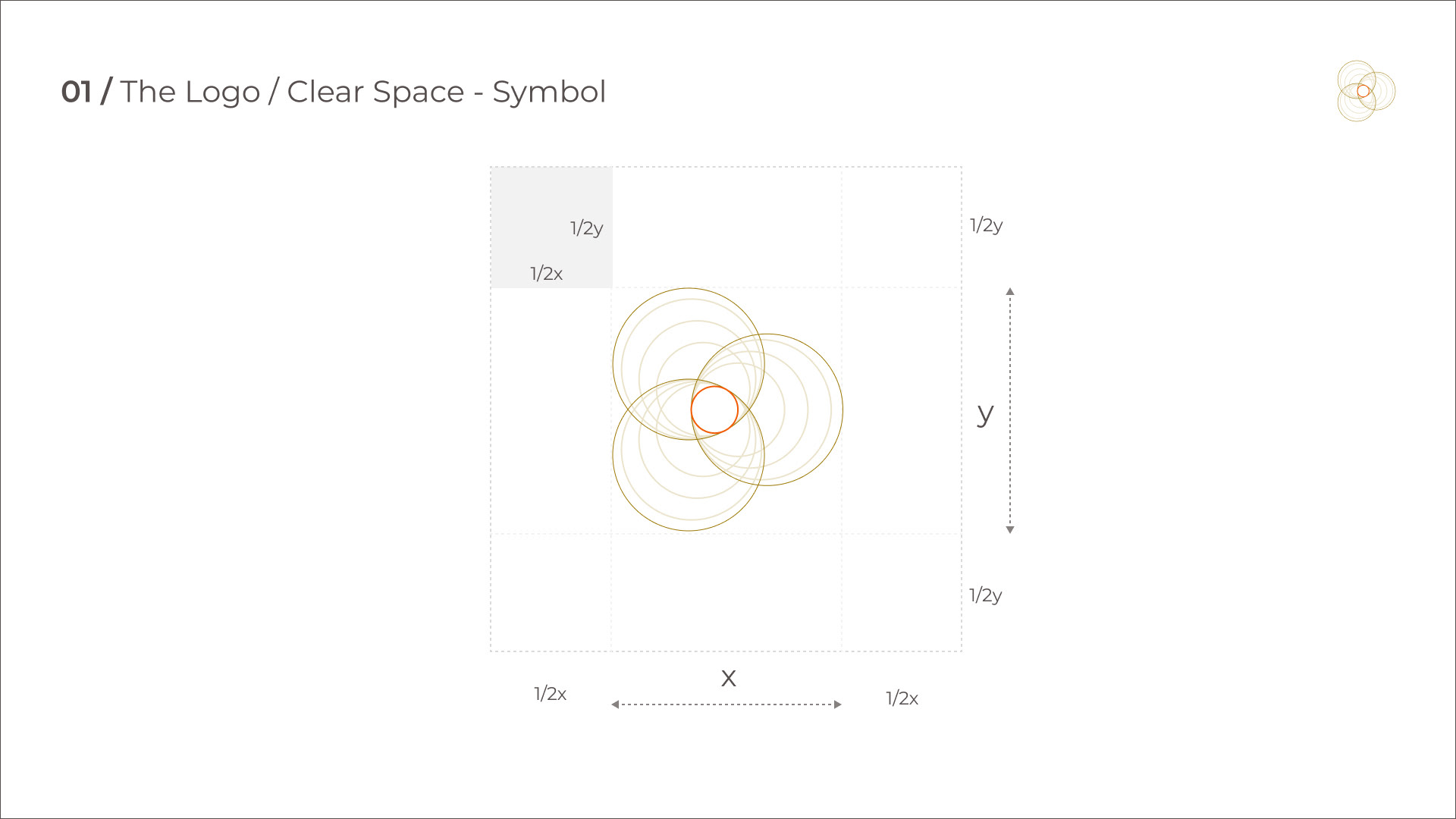
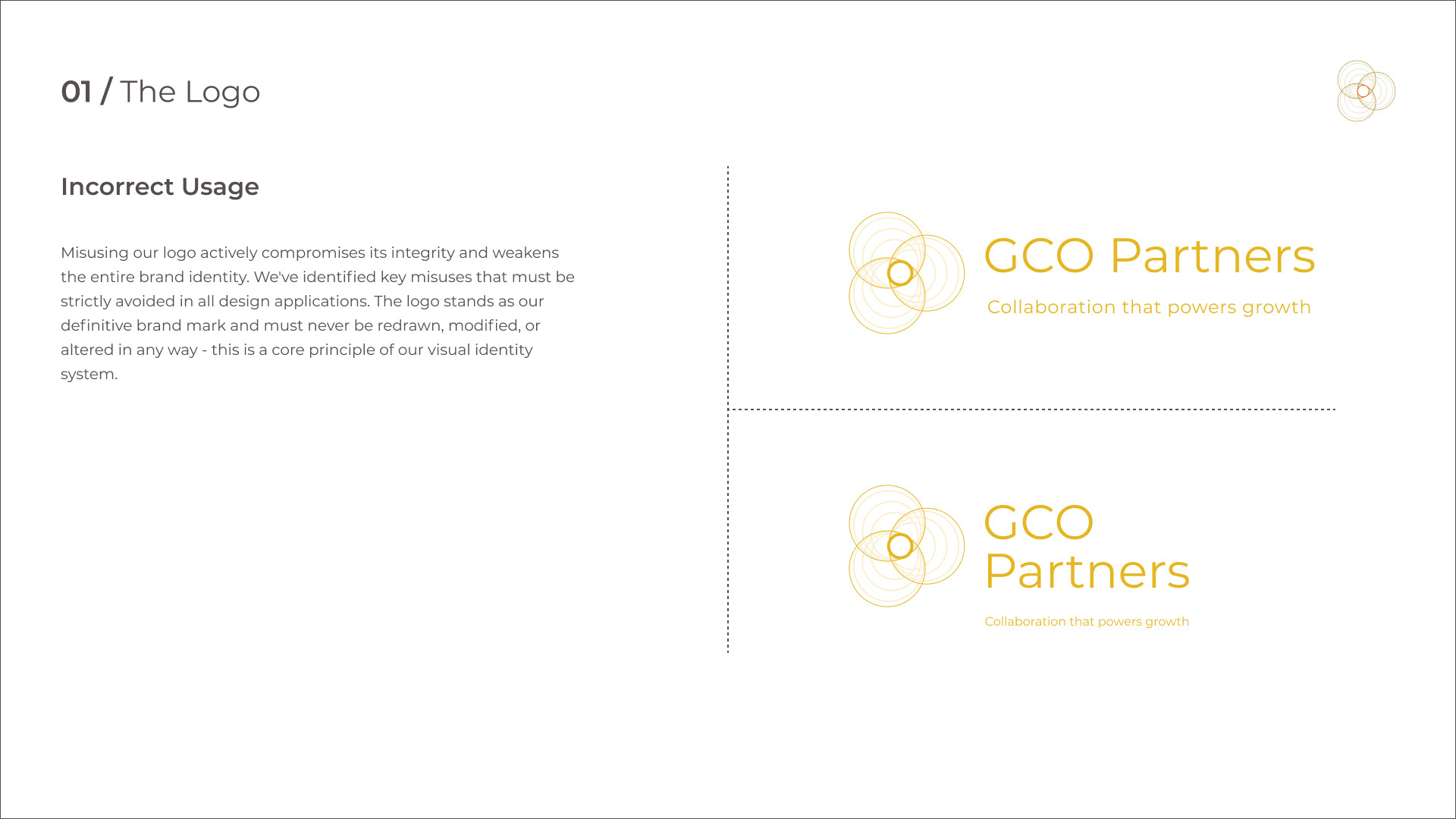
• Brand Guidelines Document
• Style Guide
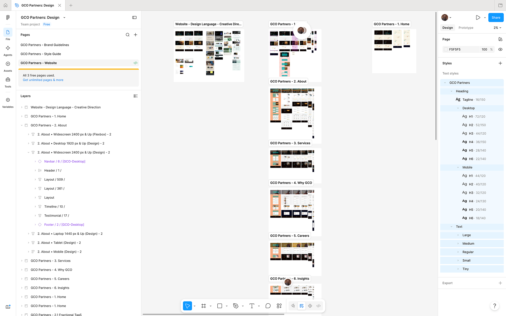
• Responsive Web Design
Our Process
• Bi-weekly Touchpoints
• Progress Review, Feedback & Planning
• Figma Collaboration
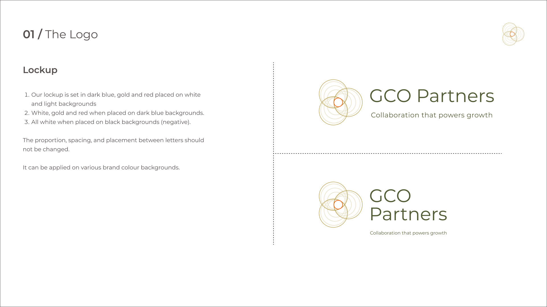
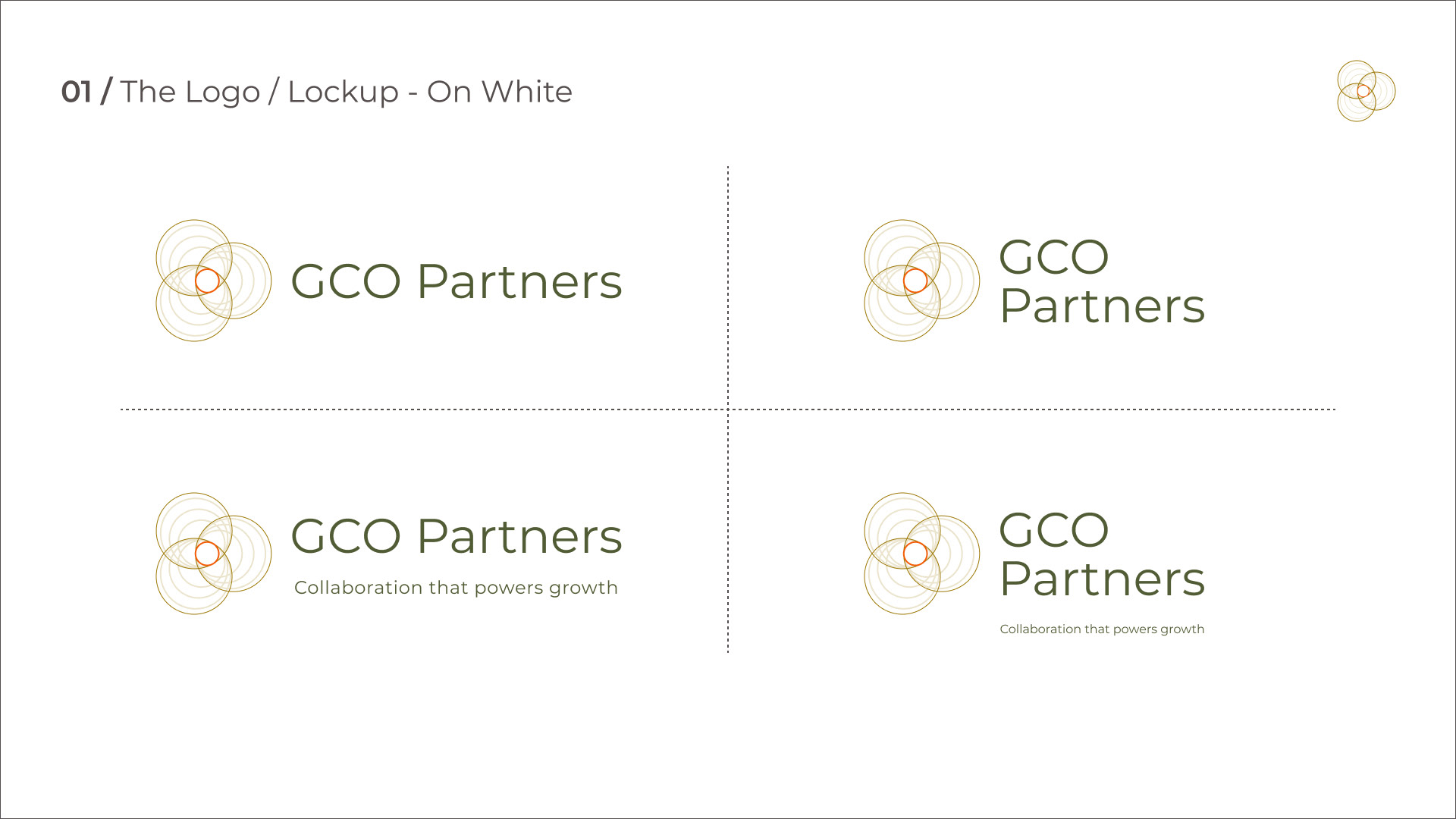
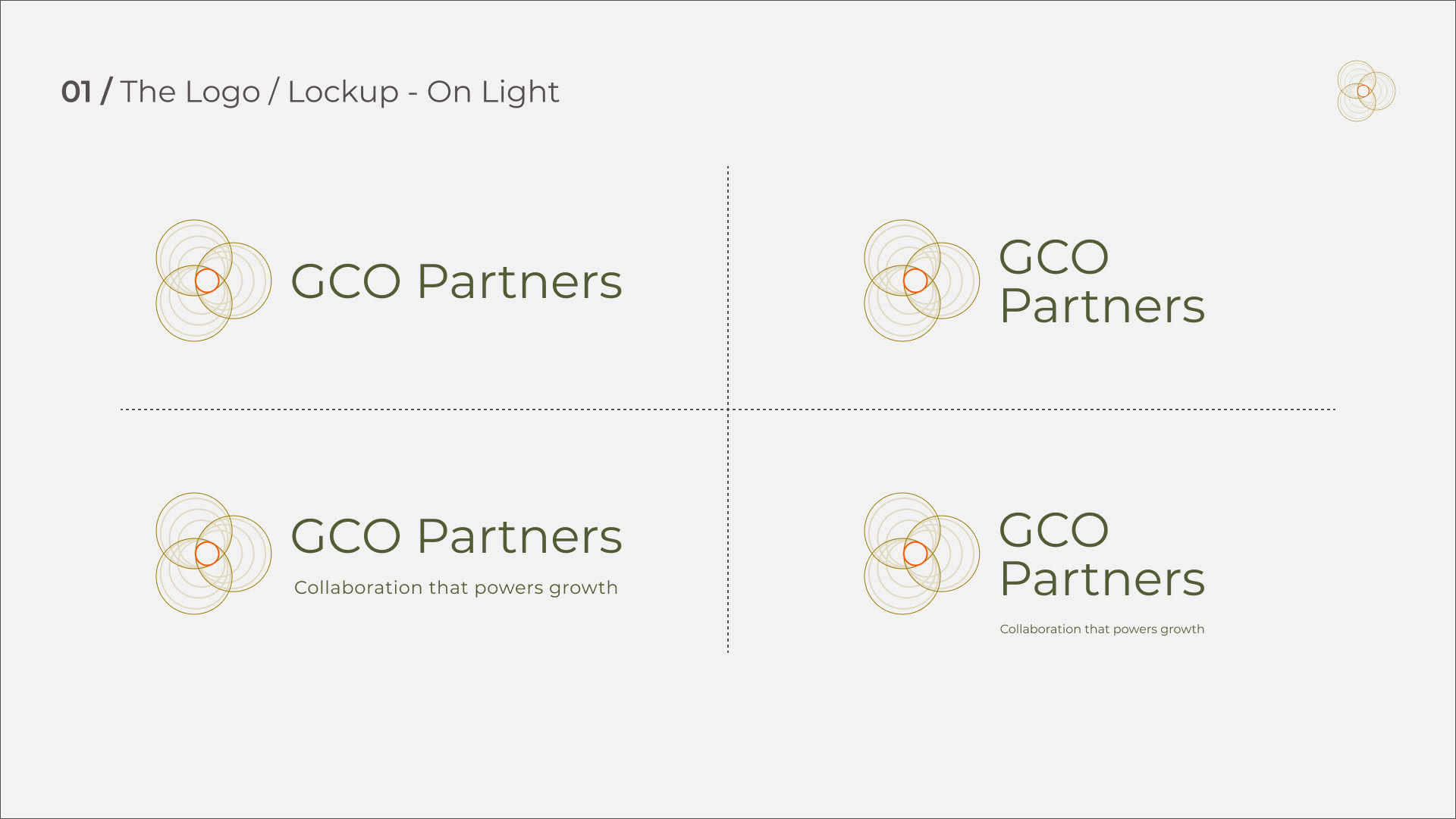
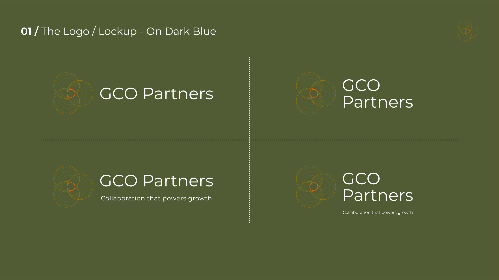
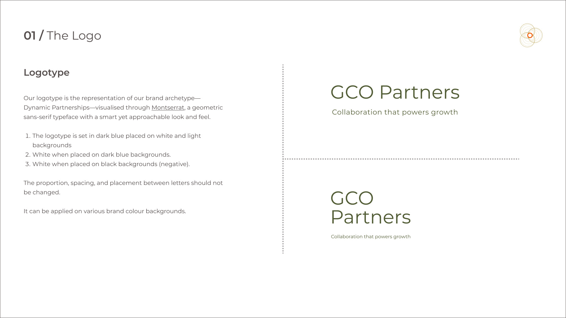
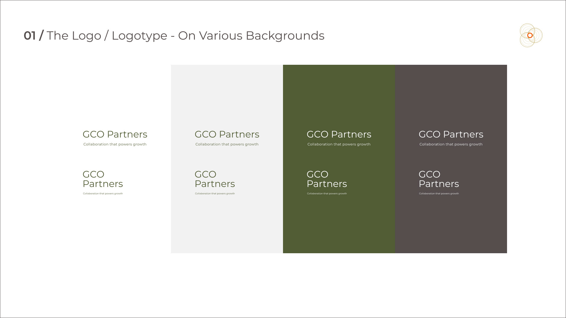
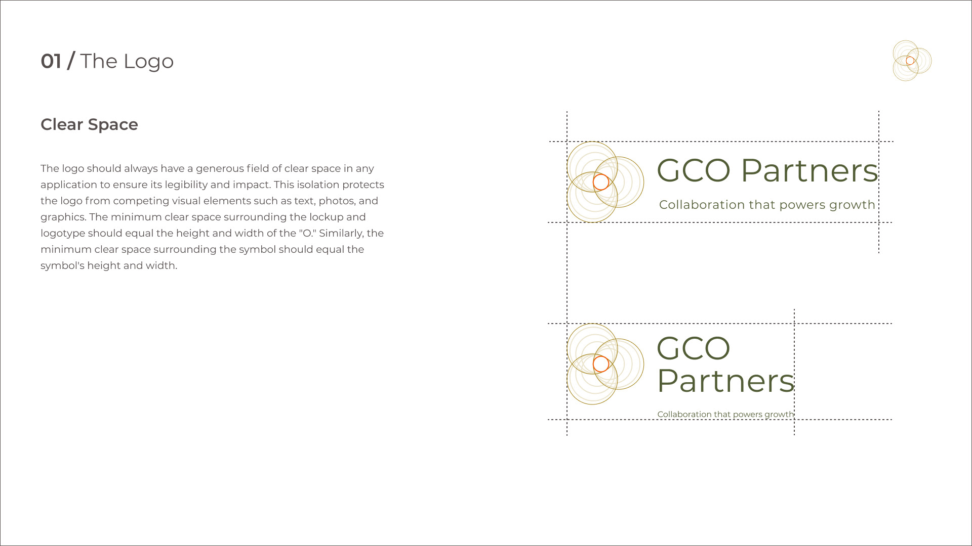
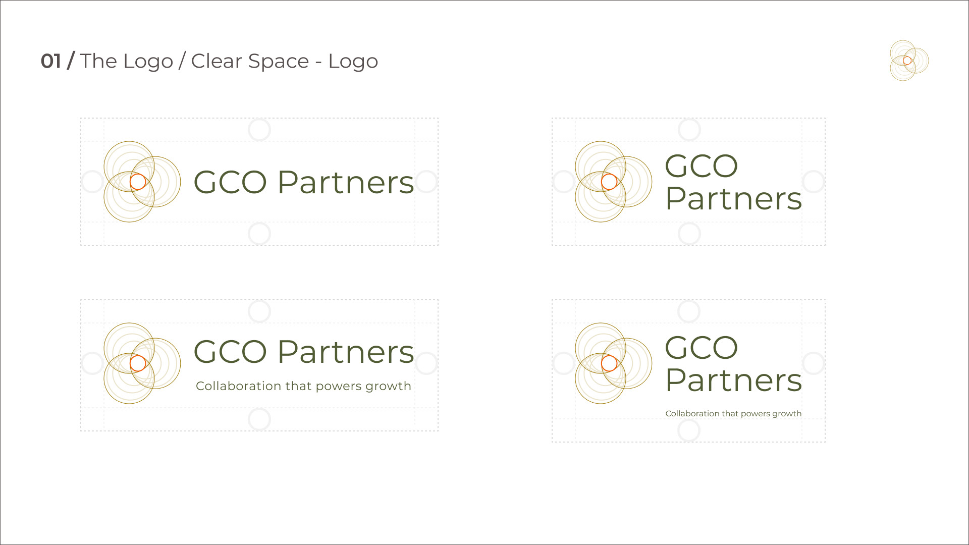
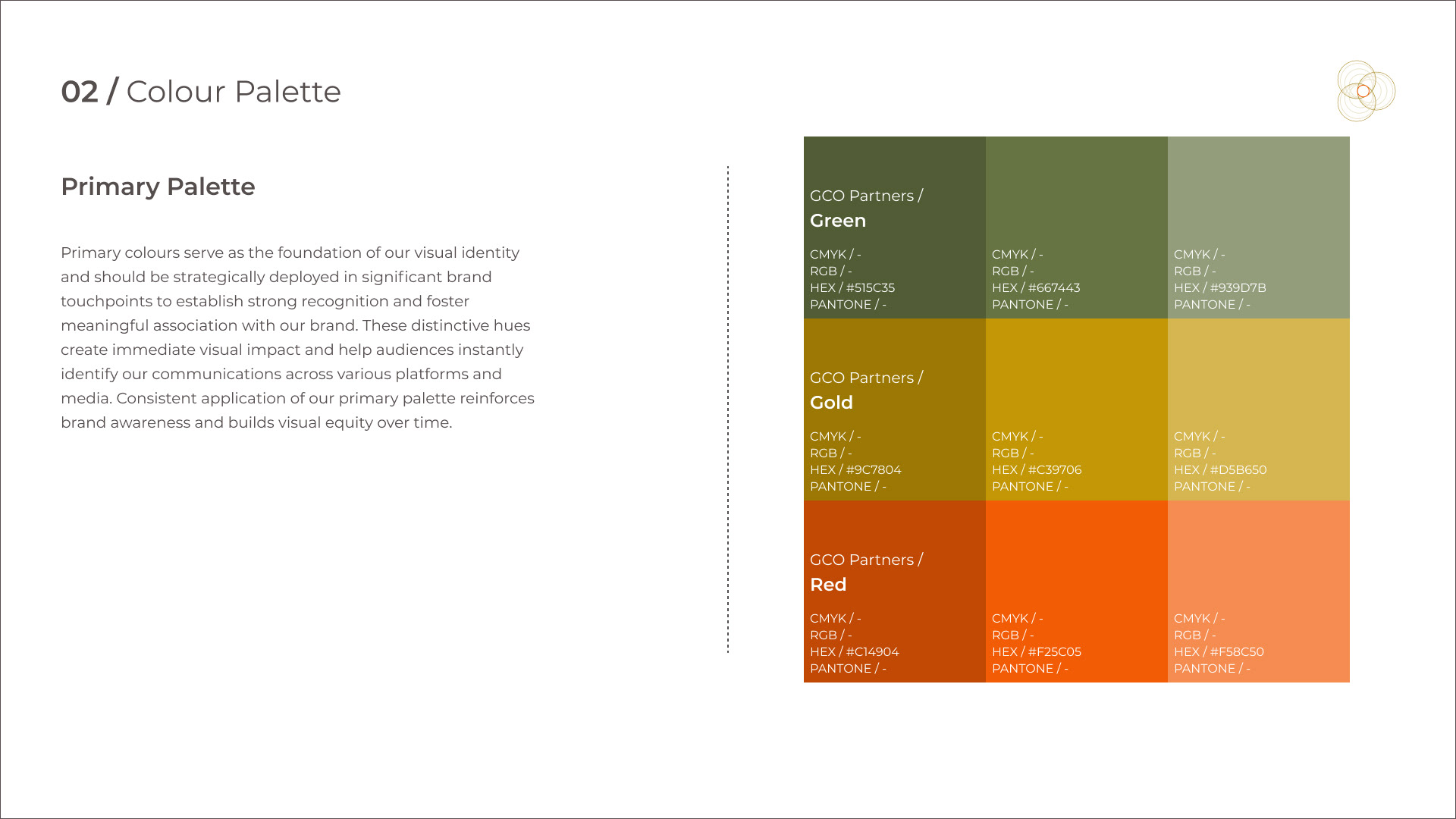
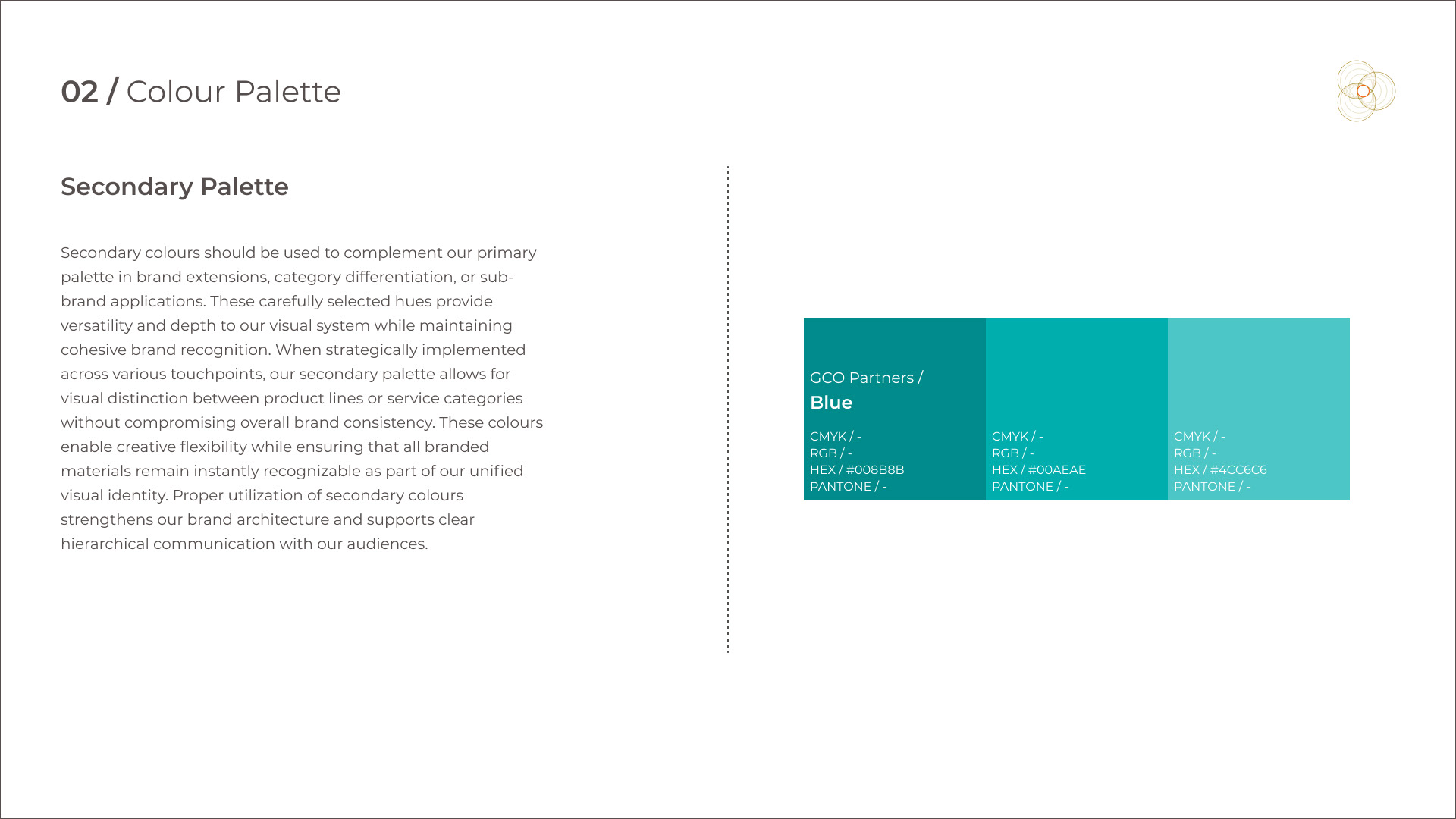
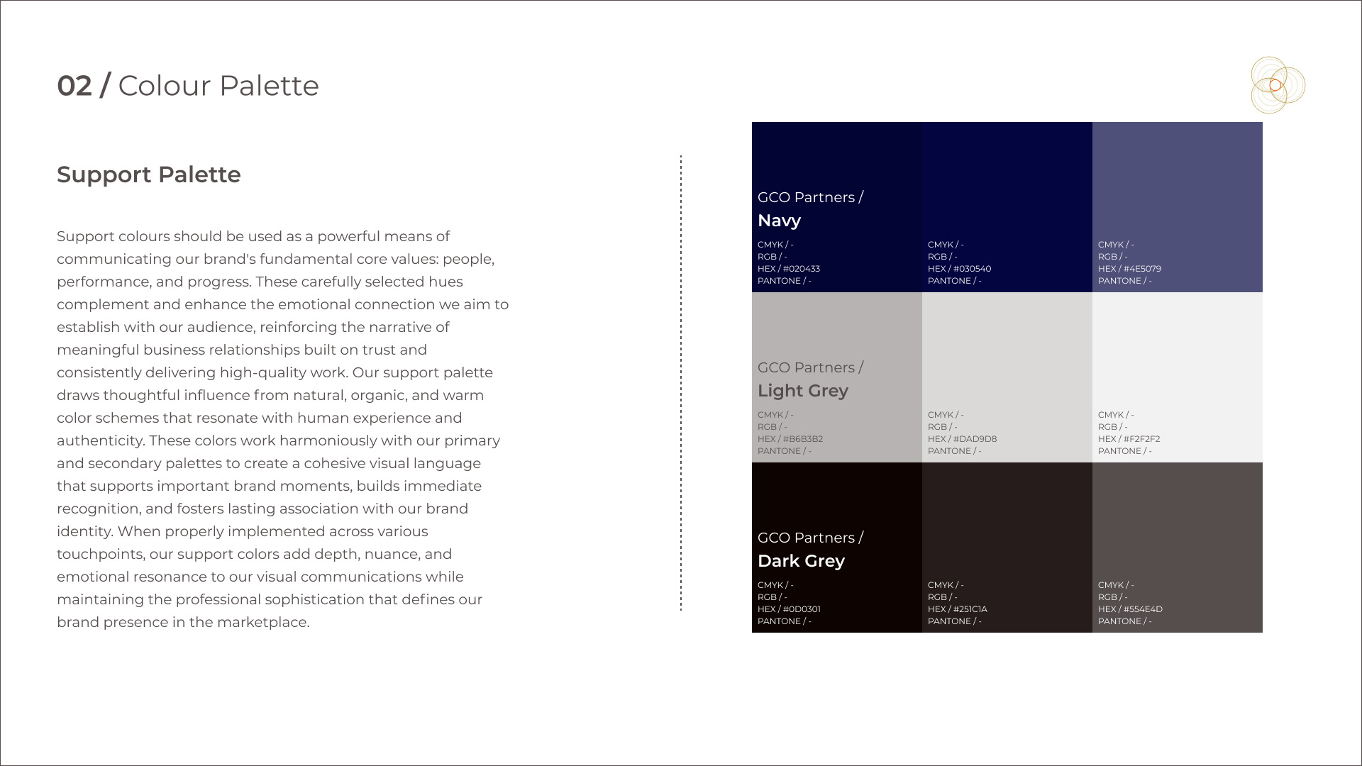
Workflow: Research & Discovery
A visual brand audit is a comprehensive review of a brand's visual elements to assess their alignment with the brand's identity, consistency, and overall effectiveness. It involves scrutinizing logos, colors, typography, imagery, and layouts across all brand touchpoints to ensure a cohesive and impactful visual representation.
• Visual Brand Identity Audit
• Ideation
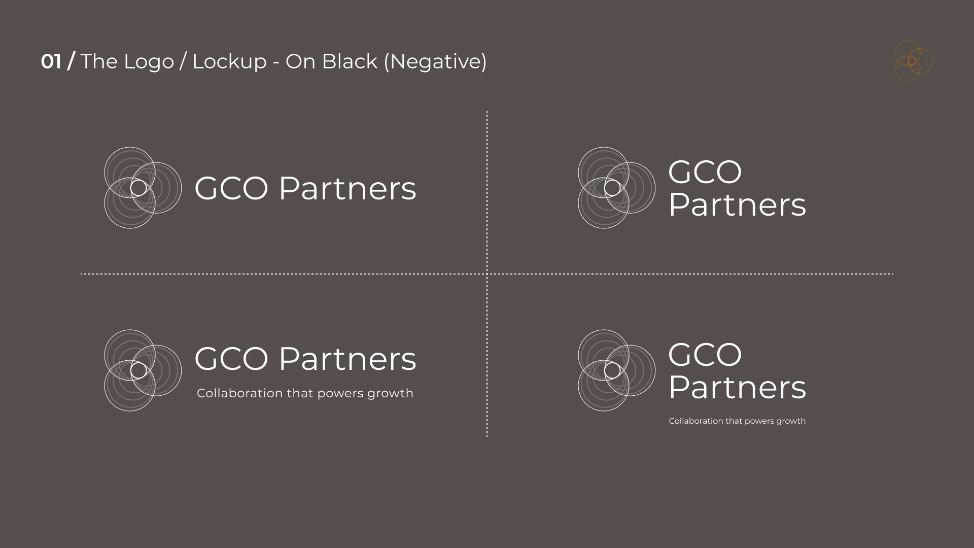
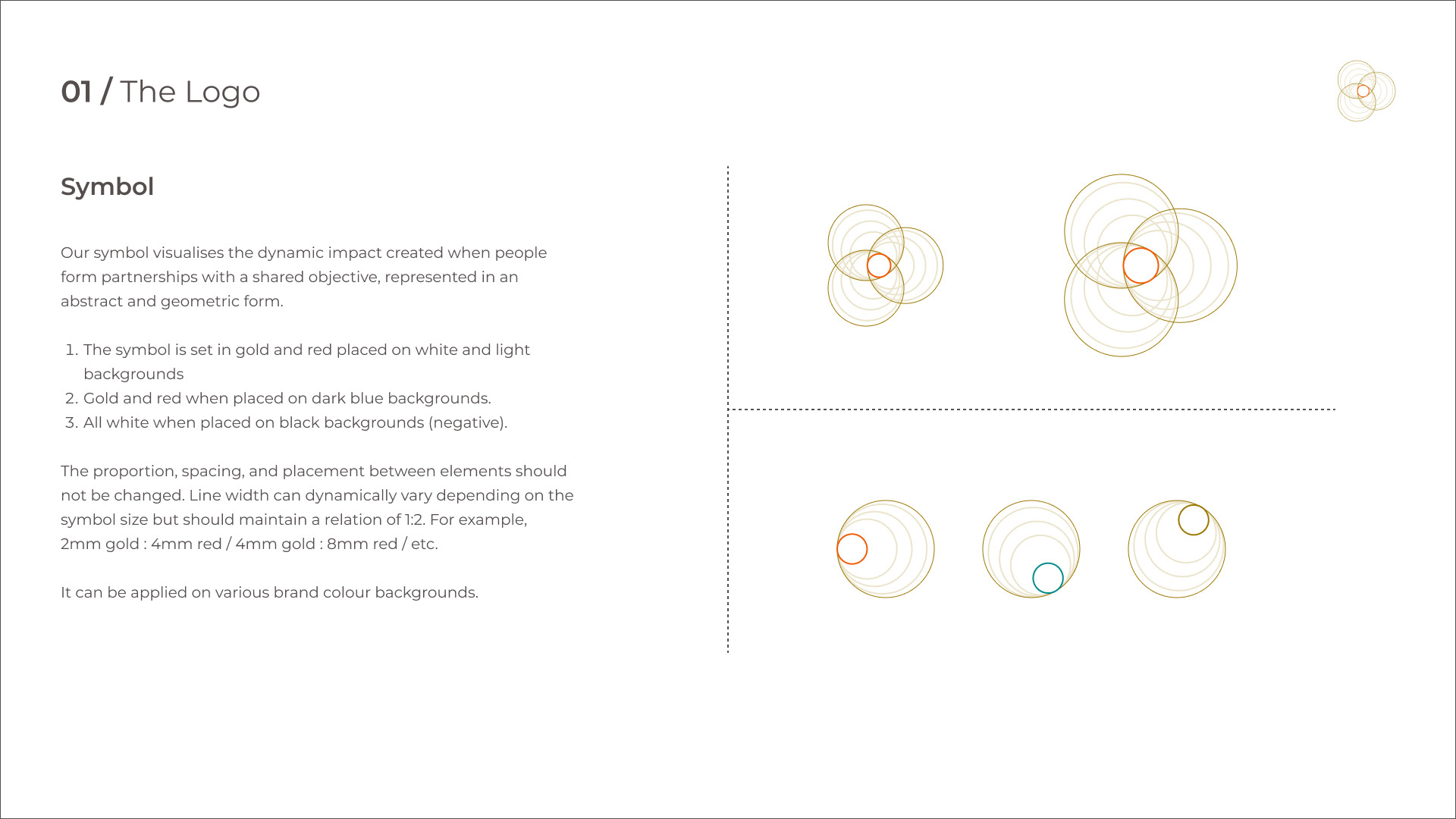
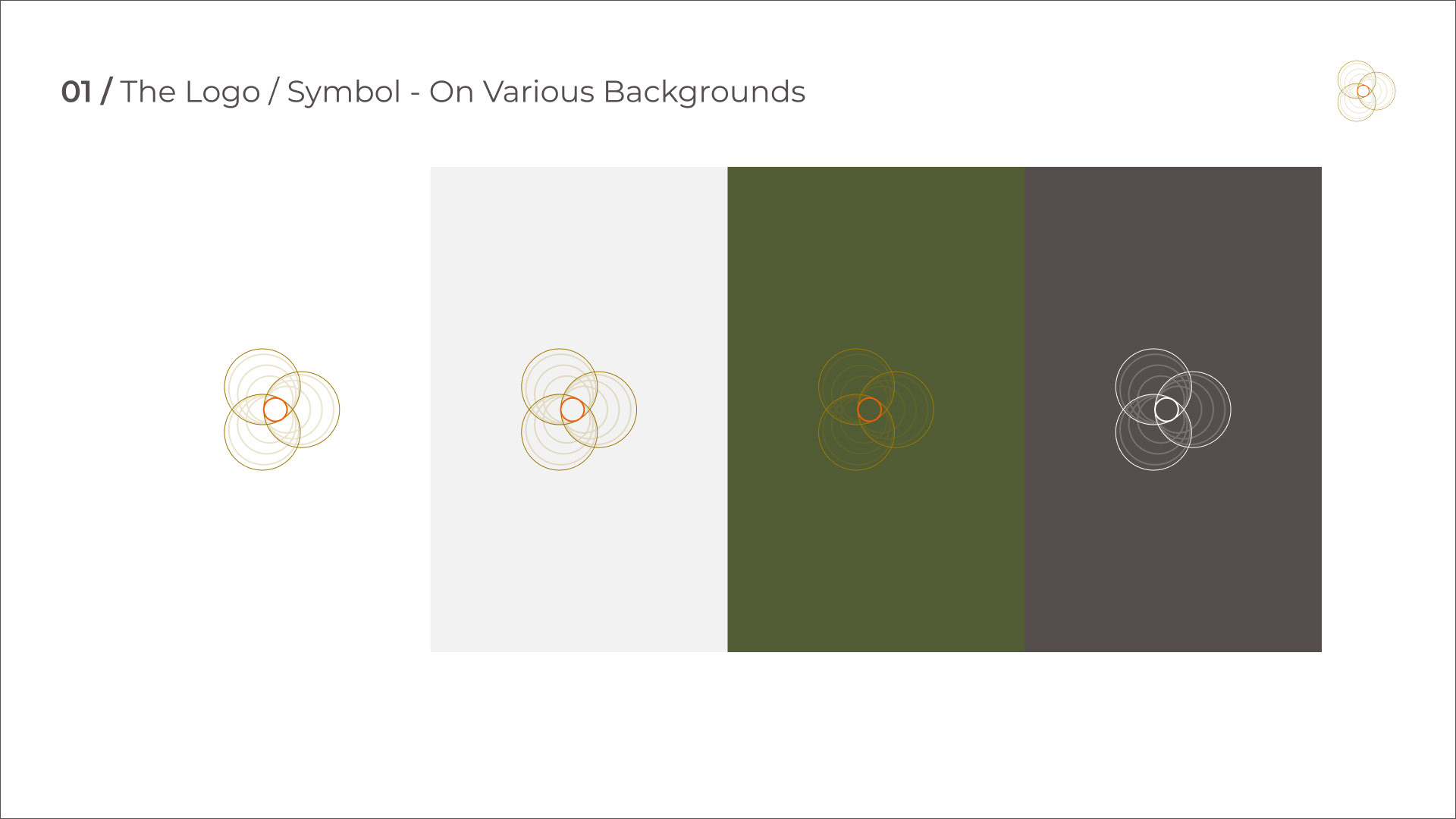
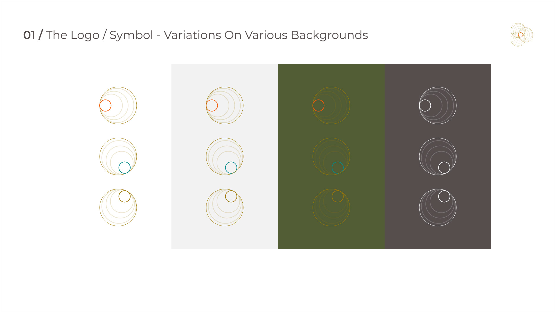
• Brand Identity & Brand Guidelines
• Style Guide
• Responsive Design Templates
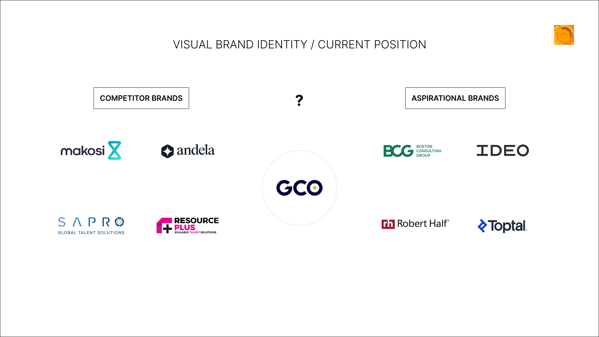
Visual Identity / Current Position
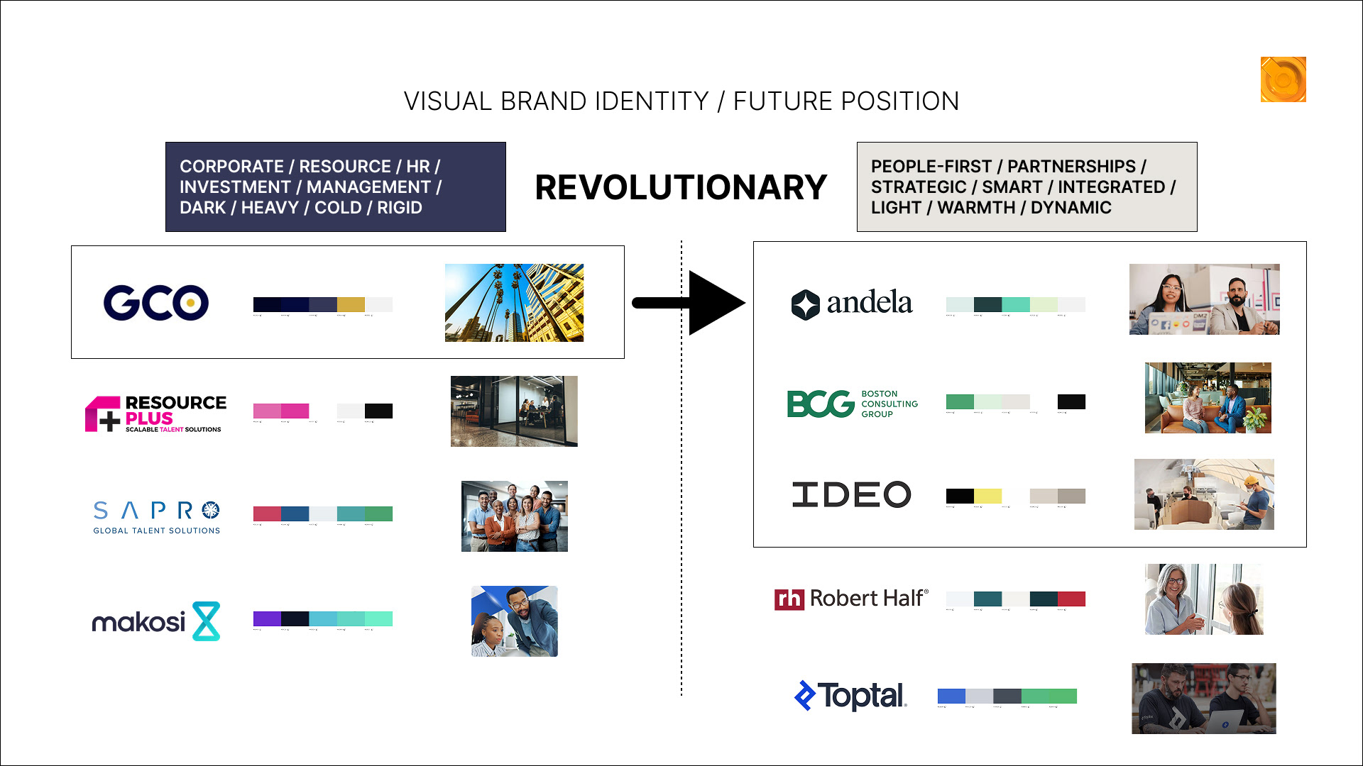
Visual Identity / Future Position
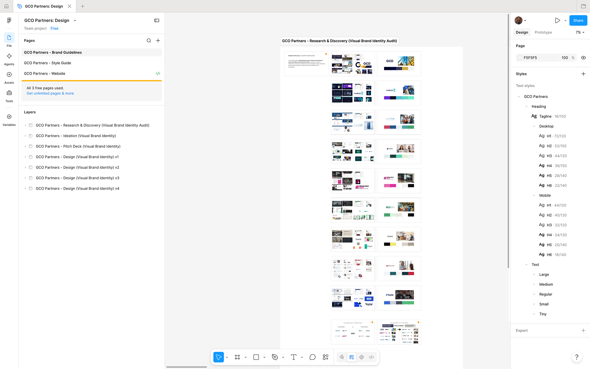
Visual Brand Identity Audit
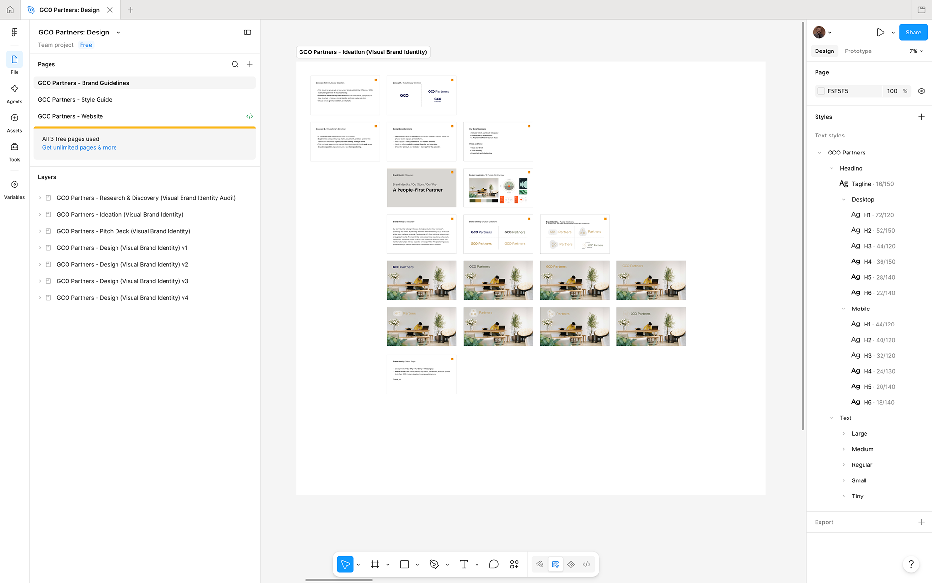
Ideation
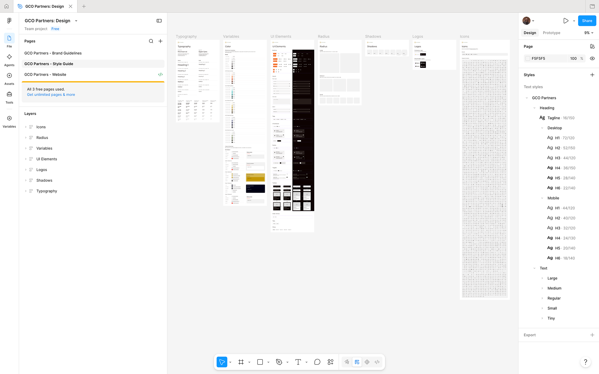
Style Guide