The problem we are solving.
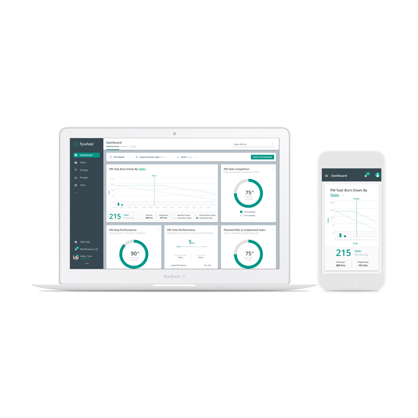
Relayr is an Industrial Internet of Things (IIoT) company delivering complete solutions for risk-free digital transformation and supporting their customers on the journey to Equipment as a Service.
How might we create a single source of truth across the organization? This effort involved a large team of designers, developers, and business analysts, and aimed to ensure consistency and reliability across all digital solutions.
The process we follow.
Agile Product Development
Research & Discovery
Ideation
Prototyping
The outcomes and results.
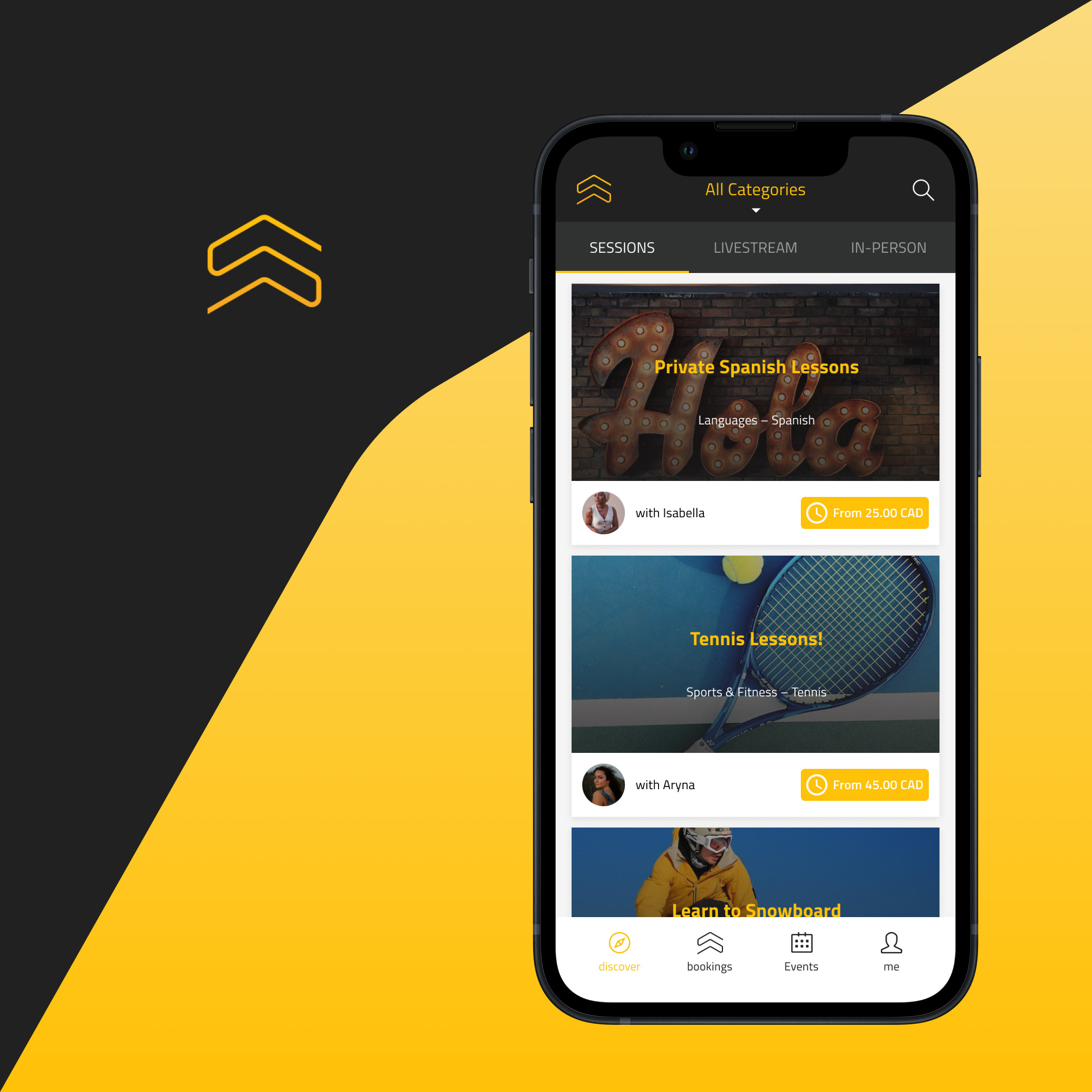
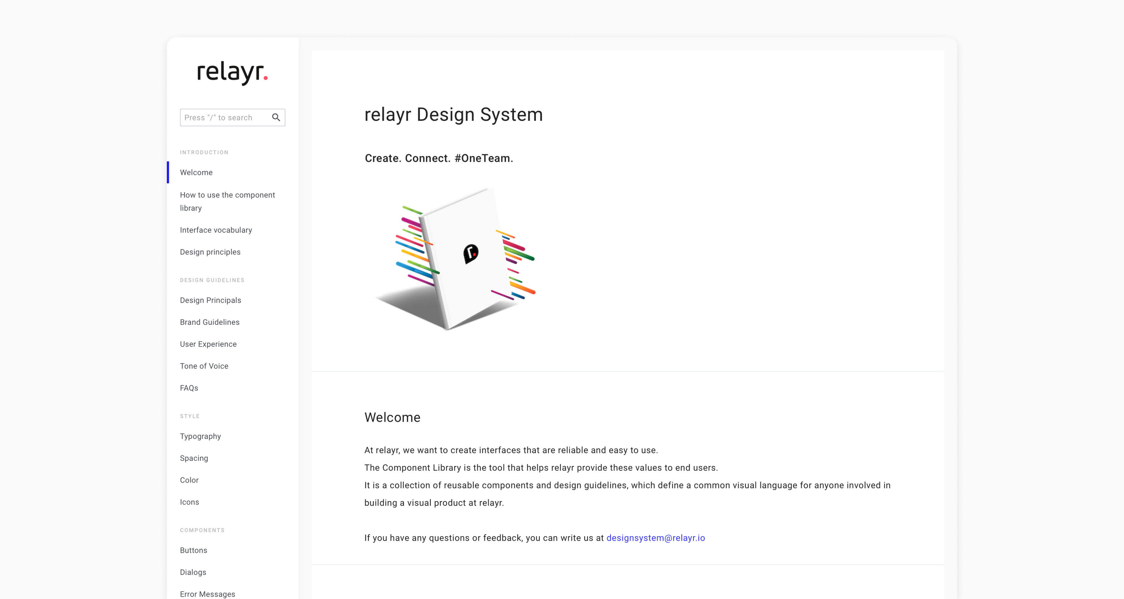
relayer Design System
My role in the project.
Research & Discovery
Template Design
Documentation
Prototyping
Research & Discovery
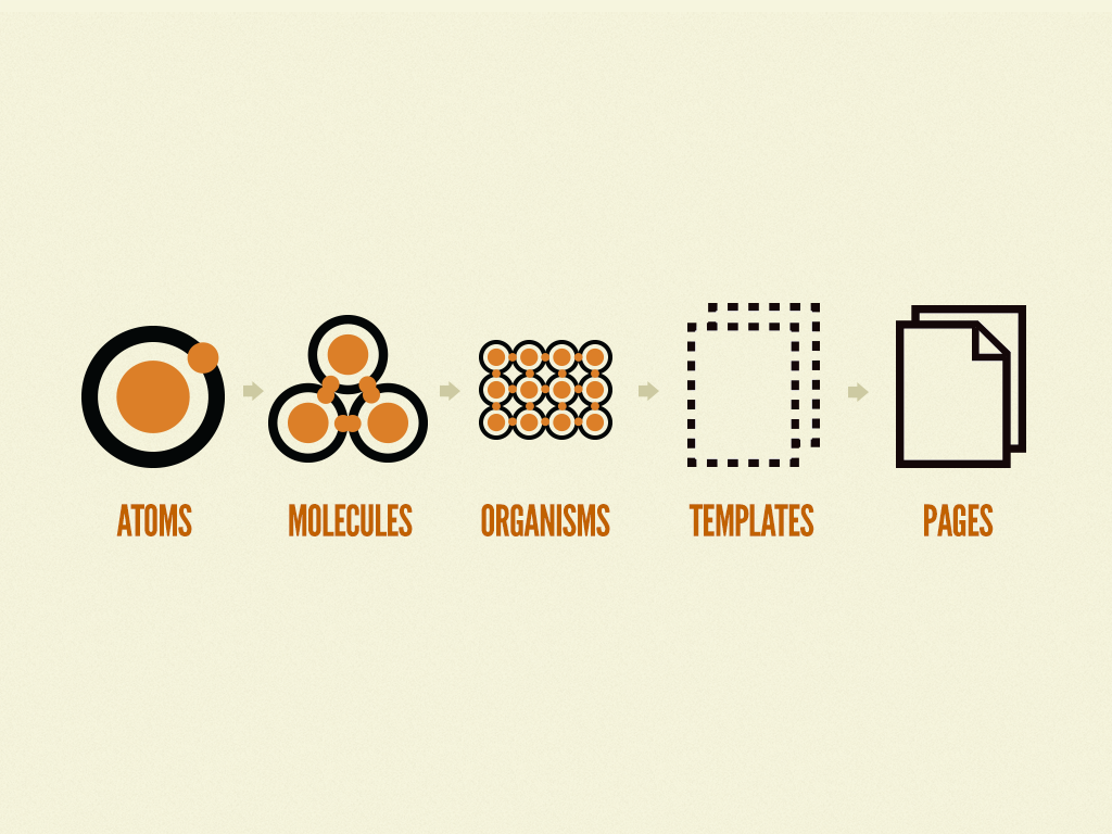
Atomic Design Methodology by Brad Frost.
An atomic component structure is a methodology used in design systems where components are broken down into their smallest, most basic pieces (atoms) and then combined to create more complex components. This approach allows for greater consistency and flexibility in designing user interfaces.
Atomic (Component-Driven Design)
• Atoms
• Molecules
• Organisms
• Templates
• Pages
• Atoms
• Molecules
• Organisms
• Templates
• Pages
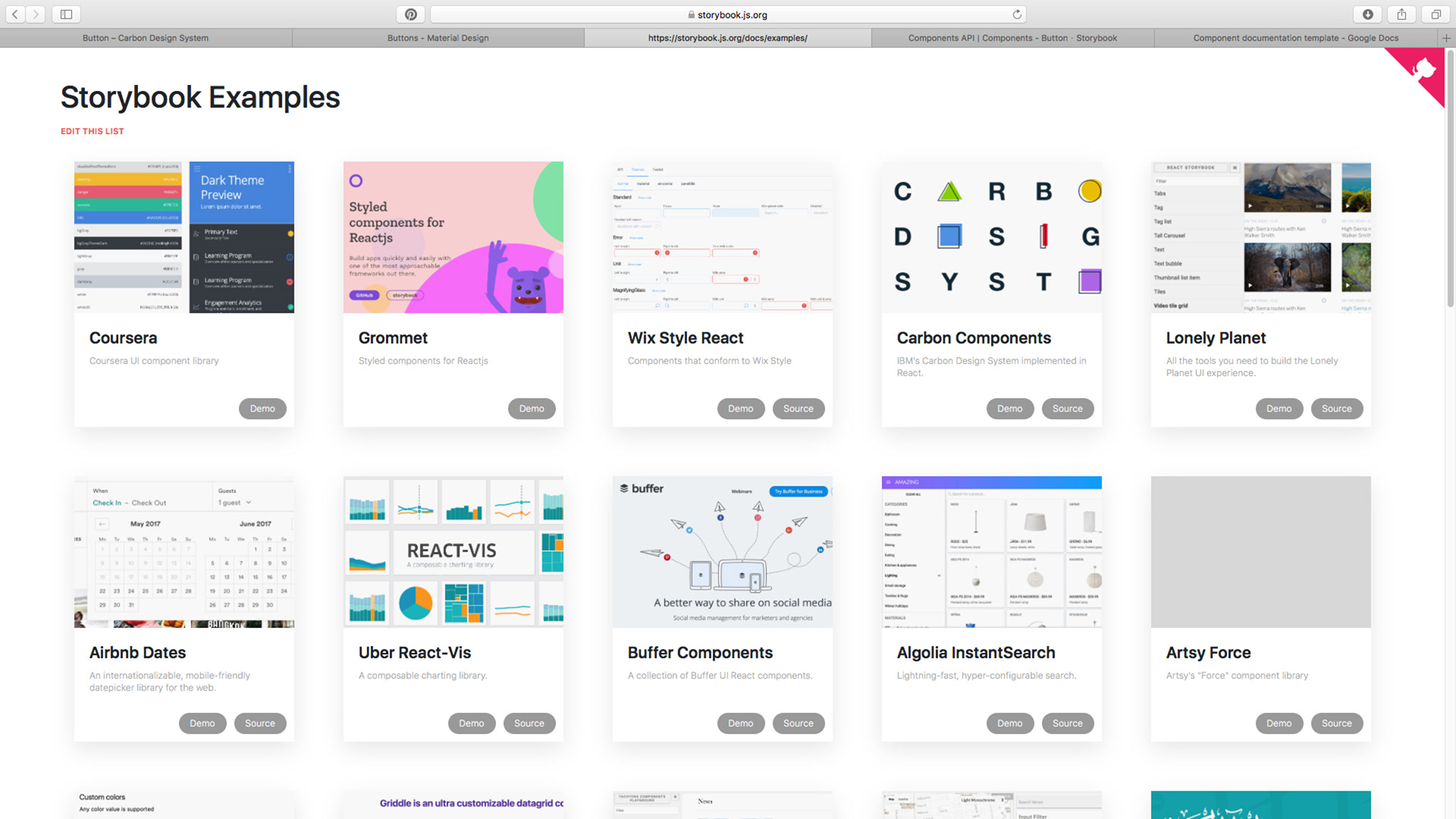
Benchmarking
We began the design process by comparing and evaluating our component library against industry best practices and standards. This allowed us to identify areas for improvement and opportunities to optimize the structure and design.
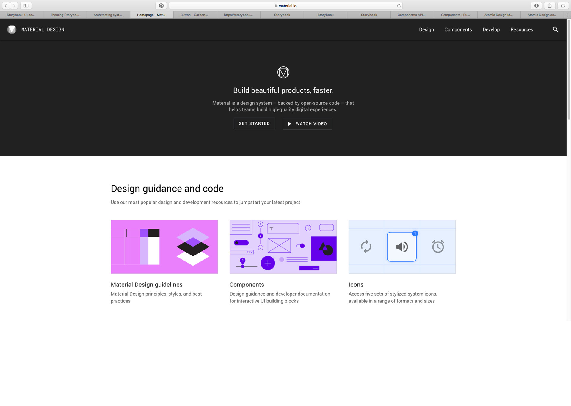
Google Material Design
Goals
Create
• Create a visual language that synthesizes the classic principles of good design with the innovation and possibility of technology and science.
• Create a visual language that synthesizes the classic principles of good design with the innovation and possibility of technology and science.
Unify
• Develop a single underlying system that unifies the user experience across platforms, devices, and input methods.
• Develop a single underlying system that unifies the user experience across platforms, devices, and input methods.
• Customize
Expand Material’s visual language and provide a flexible foundation for innovation and brand expression.
Expand Material’s visual language and provide a flexible foundation for innovation and brand expression.

Design Guidance & Code
Material Design Guidelines
• Material Design Principles, Styles, and Best Practices
• Material Design Principles, Styles, and Best Practices
Components
• Design guidance and developer documentation for interactive UI building blocks
• Design guidance and developer documentation for interactive UI building blocks
Icons
• Access five sets of stylized system icons, available in a range of formats and sizes
• Access five sets of stylized system icons, available in a range of formats and sizes
Accessibility Guidelines
• Learn how to help users of diverse abilities navigate, understand, and use your UI
• Learn how to help users of diverse abilities navigate, understand, and use your UI
Design Guidelines
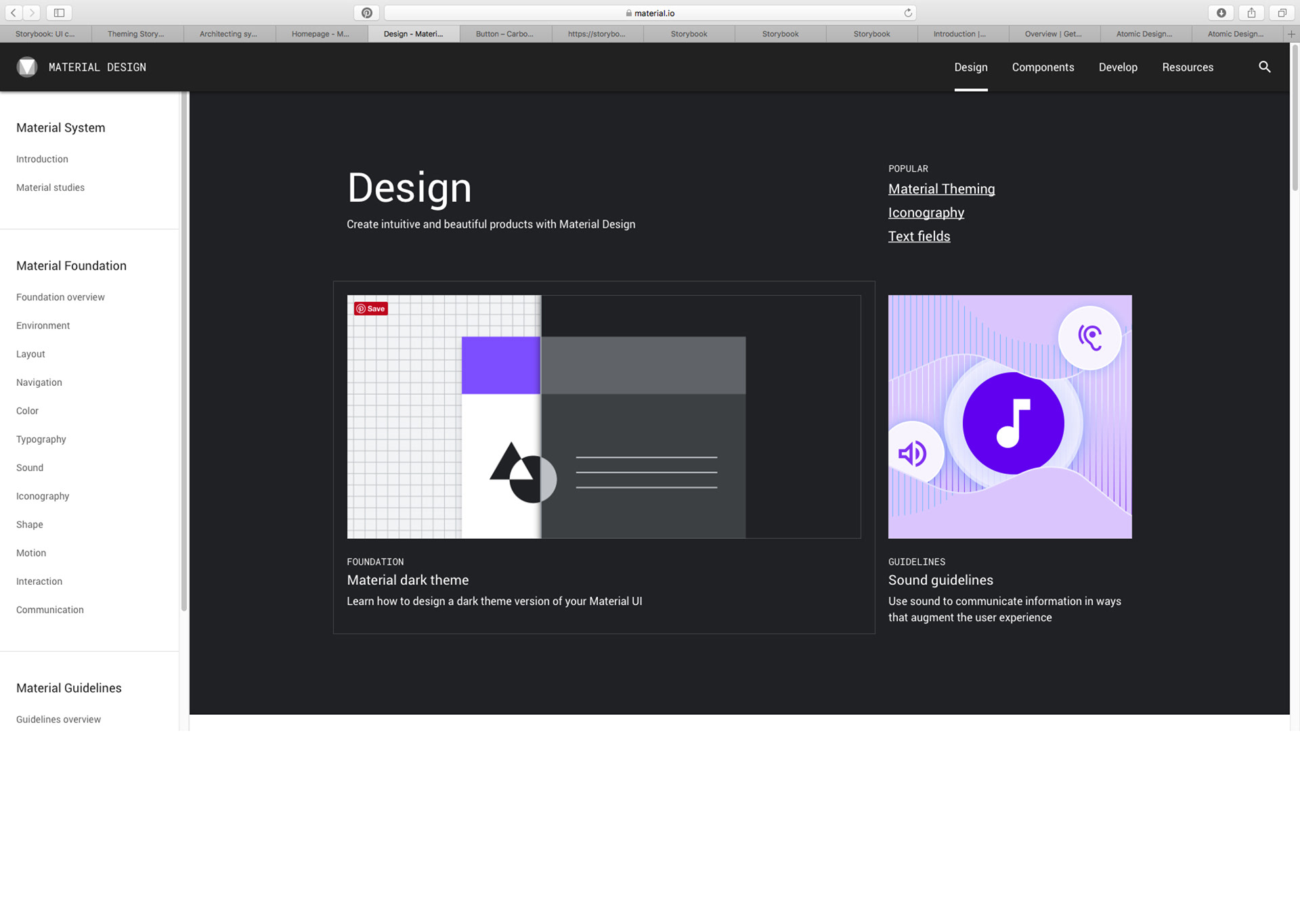
Material System
• Introduction
• Material Studies
• Introduction
• Material Studies
Material Foundation
• Foundation Overview
• Environment
• Layout
• Navigation
• Color
• Typography
• Sound
• Iconography
• Shape
• Motion
• Interaction
• Communication
• Foundation Overview
• Environment
• Layout
• Navigation
• Color
• Typography
• Sound
• Iconography
• Shape
• Motion
• Interaction
• Communication
Material Guidelines
• Guidelines Overview
• Material Theming
• Usability
• Platform Guidance
• Guidelines Overview
• Material Theming
• Usability
• Platform Guidance
Components
App Bars: bottom
App Bars: top
Backdrop
Banners
Bottom Navigation
Buttons
Buttons: floating action button
Cards
Chips
Data Tables
Dialogs
Dividers
Image Lists
Lists
Navigation Drawer
Navigation Rail
Pickers
Progress Indicators
Selection Controls
Sheets: bottom
Sheets: side
Sliders
Snackbars
Tabs
Text Fields
Tooltips

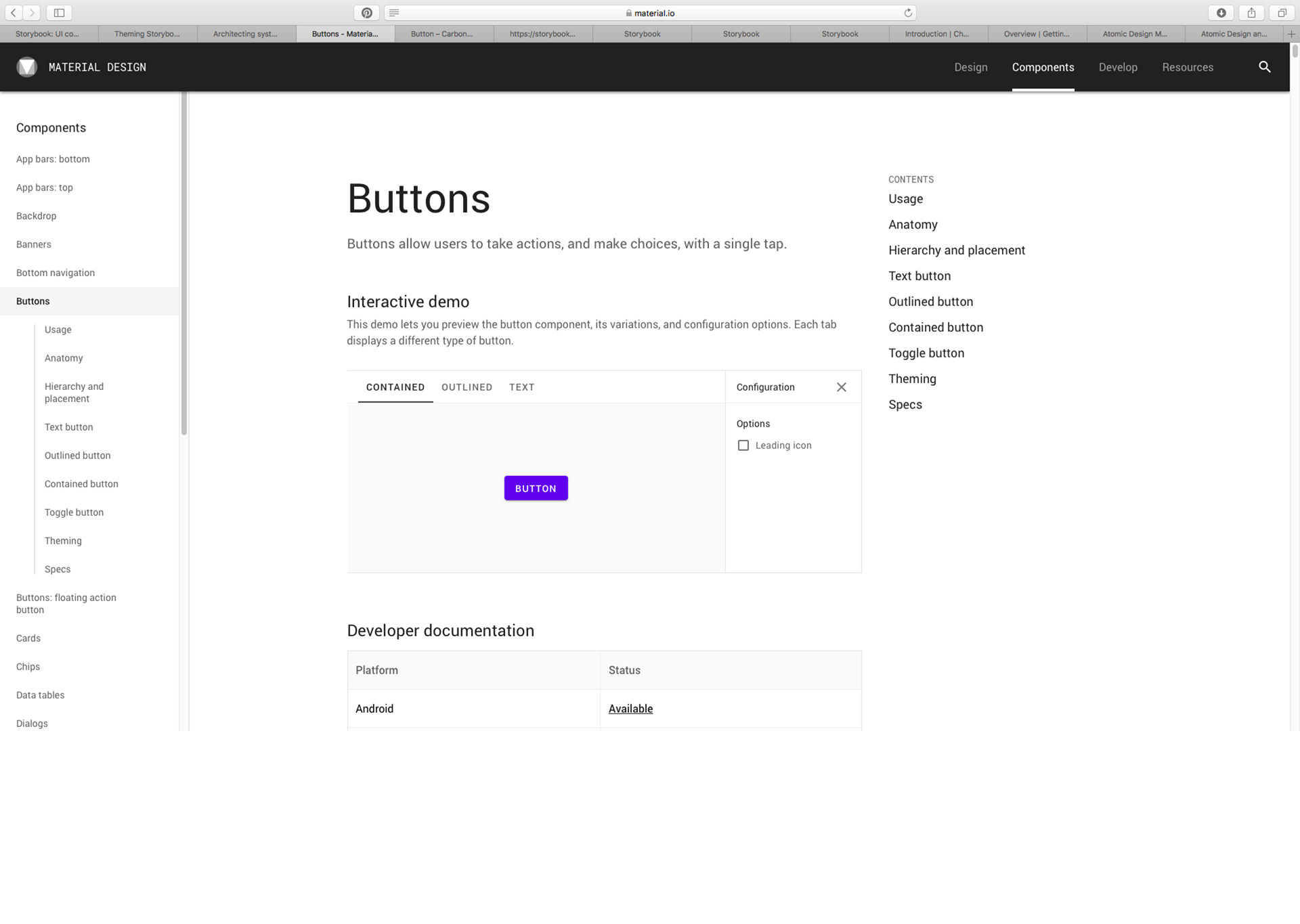
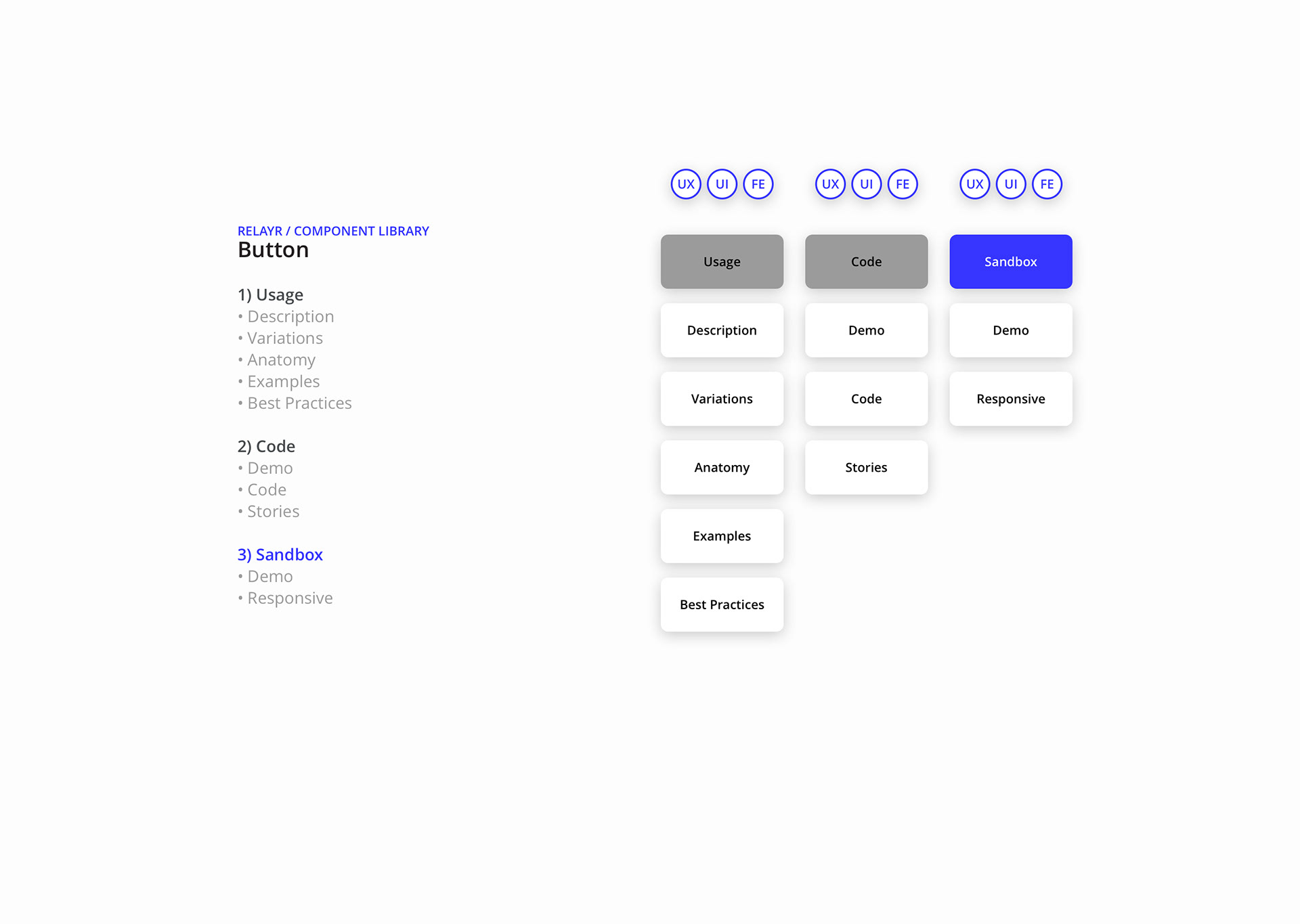
Buttons
• Demo
• Developer Documentation
• Developer Documentation
• Usage
• Principles
• Anatomy
• Hierarchy & Placement
• Text Button
• Outlined Button
• Contained Button
• Toggle Button
• Theming
• Specs
• Principles
• Anatomy
• Hierarchy & Placement
• Text Button
• Outlined Button
• Contained Button
• Toggle Button
• Theming
• Specs
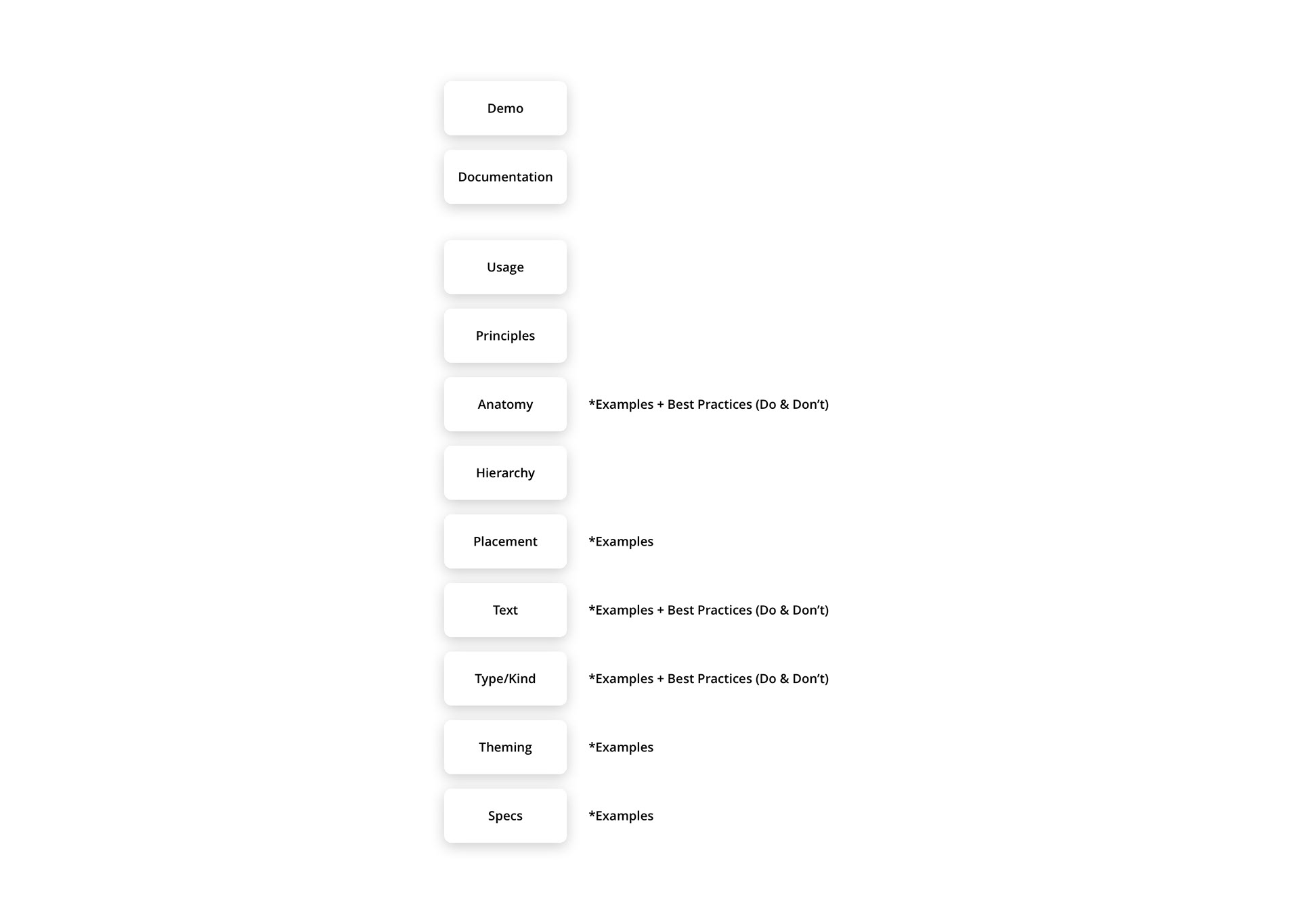
Template Structure
Carbon Design System
IBM's Open-Source Design System
• Getting Started
• Tutorial
• Guidelines
• Components
• Patterns
• Experimental
• Data Visualisation
• Resources
• How to Contribute
• Updates
• Help
• Tutorial
• Guidelines
• Components
• Patterns
• Experimental
• Data Visualisation
• Resources
• How to Contribute
• Updates
• Help
• Design Kit
• GitHub
• GitHub

Getting Started
• About Carbon
• Design
• Development
• Design
• Development

Components
• Overview
• Component Status
• Accordion
• Breadcrumb
• Button
• Checkbox
• Code Snippet
• Content Switcher
• Data Table
• Date Picker
• Dropdown
• File Uploader
• Form
• Inline Loading
• Link
• List
• Loading
• Modal
• Notification
• Number Input
• Overflow Menu
• Pagination
• Progress Indicator
• Radio Button
• Search
• Select
• Slider
• Structured List
• Tabs
• Tag
• Text Input
• Tile
• Toggle
• Tooltip
• UI Shell Header
• UI Shell Left Panel
• UI Shell Right Panel

Patterns
• Overview
• Common Actions
• Dialogs
• Disabled States
• Empty States
• Filtering
• Forms
• Global Header
• Loading
• Login
• Notifications
• Overflow Content
• Search
• Common Actions
• Dialogs
• Disabled States
• Empty States
• Filtering
• Forms
• Global Header
• Loading
• Login
• Notifications
• Overflow Content
• Search

Buttons
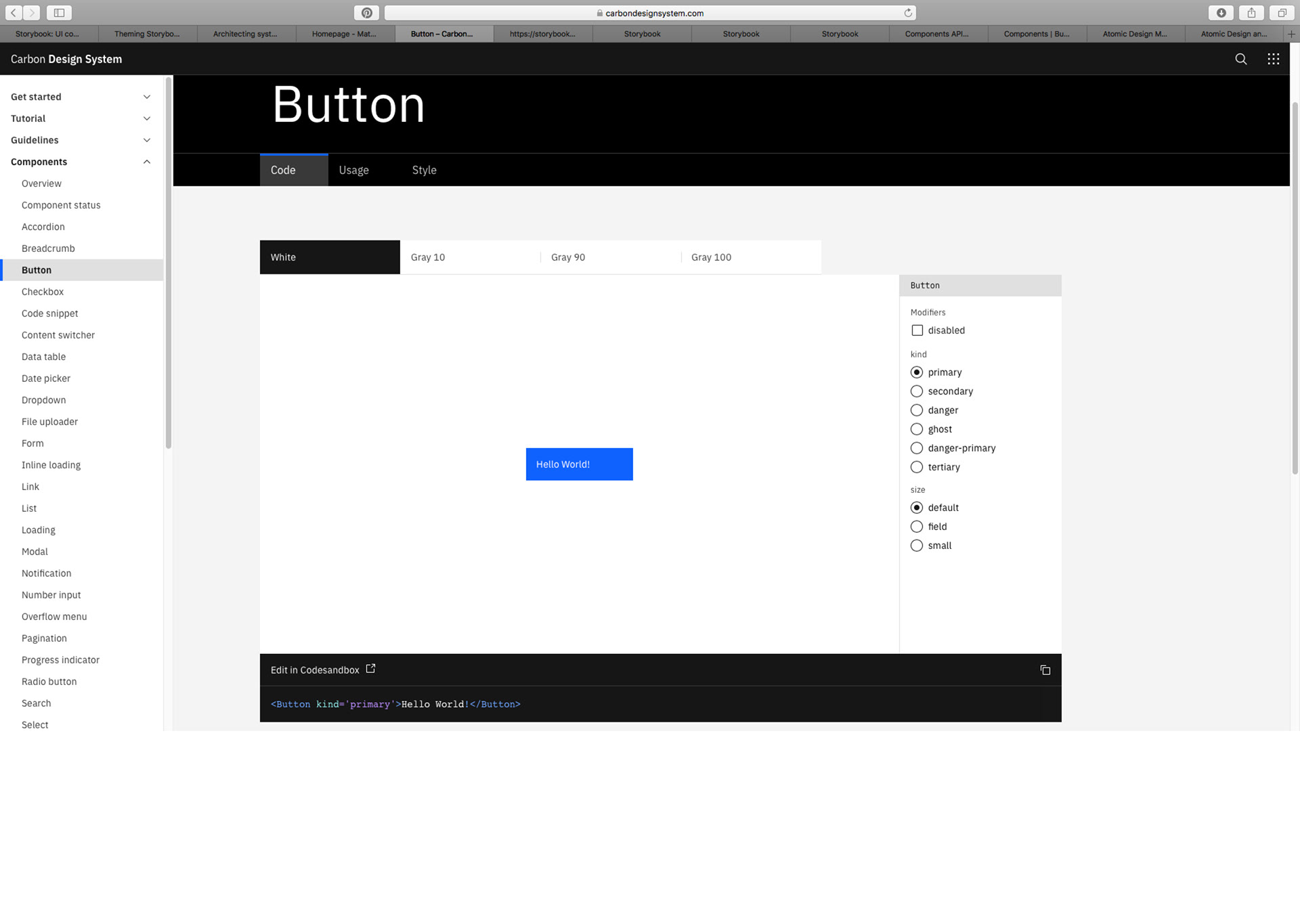
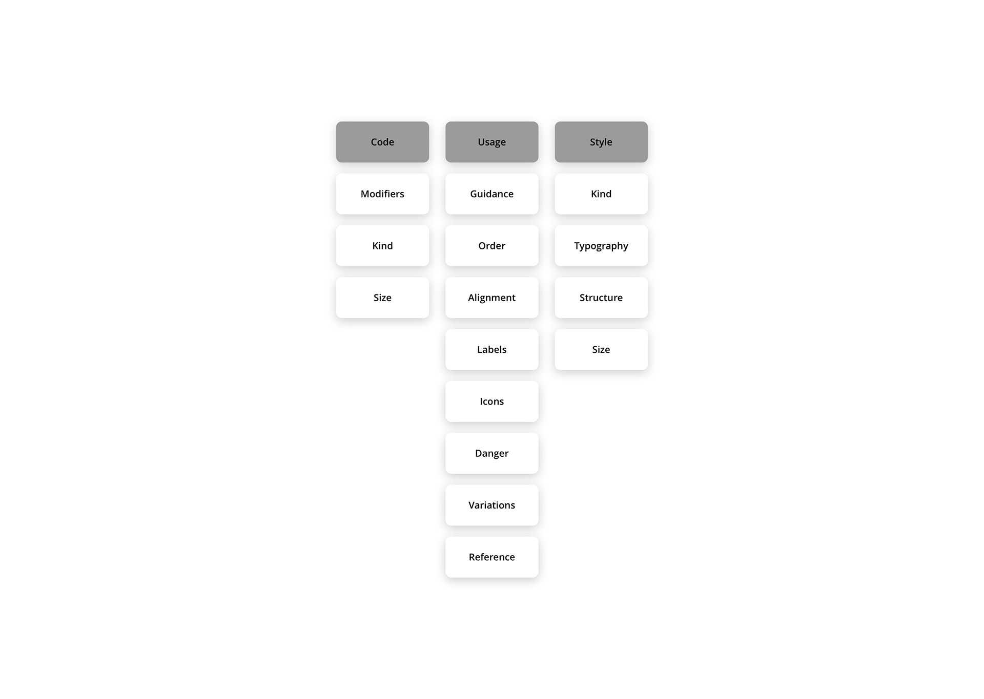
Code
• Modifiers
• Kind
• Size
• Modifiers
• Kind
• Size
Usage
• General Guidance
• Button Order
• Button Alignment
• Labels
• Icons Usage
• Danger Button Usage
• Variations
• References
• General Guidance
• Button Order
• Button Alignment
• Labels
• Icons Usage
• Danger Button Usage
• Variations
• References
Style
• Kind
• Typography
• Structure
• Sizes
• Kind
• Typography
• Structure
• Sizes
Template Structure
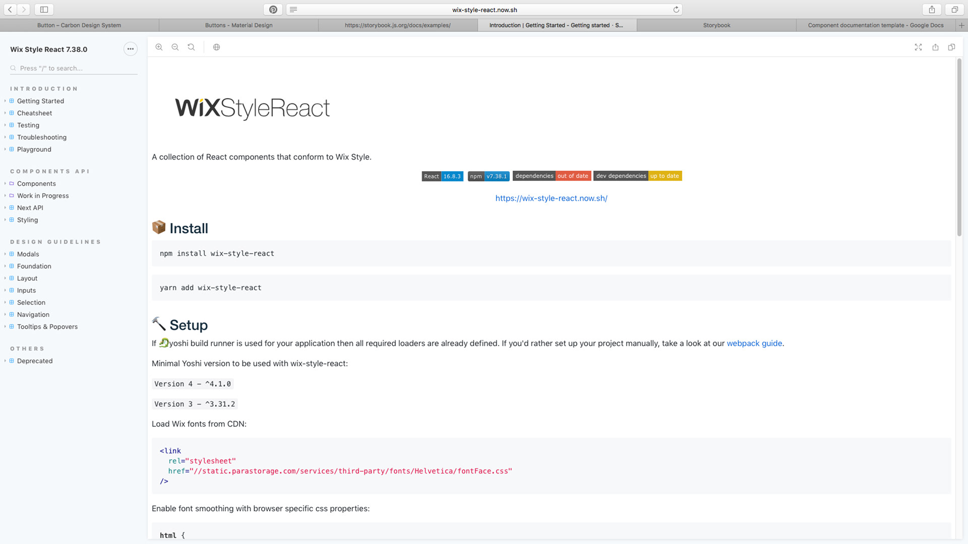
Wix Design System
Storybook Examples
Index
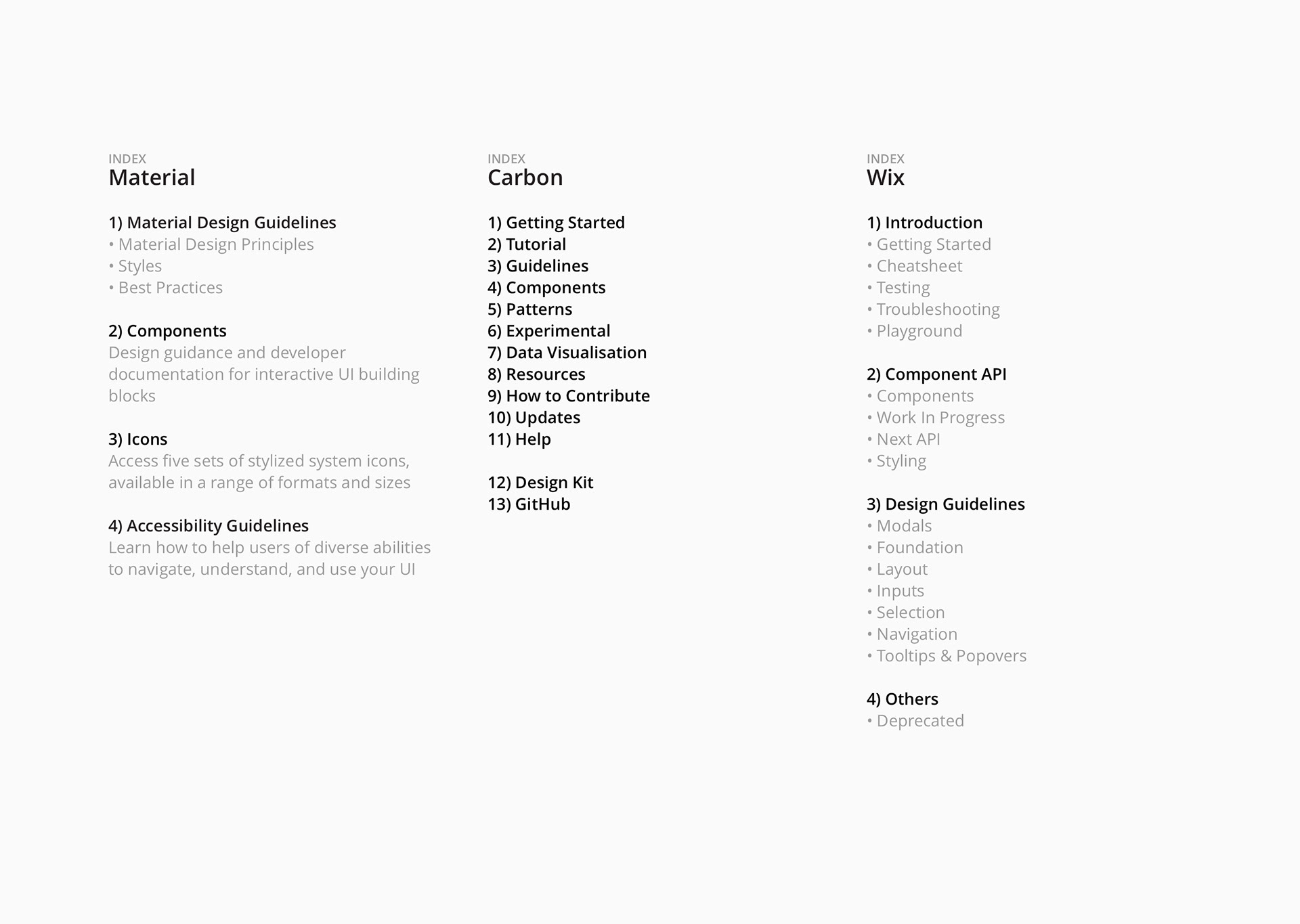
Introduction
• Getting Started
• Cheatsheet
• Testing
• Troubleshooting
• Playground
Component API
• Components
• Work In Progress
• Next API
• Styling
• Components
• Work In Progress
• Next API
• Styling
Design Guidelines
• Modals
• Foundation
• Layout
• Inputs
• Selection
• Navigation
• Tooltips & Popovers
• Modals
• Foundation
• Layout
• Inputs
• Selection
• Navigation
• Tooltips & Popovers
Others
• Deprecated
• Deprecated
Components Cheatsheet
Foundation
• Typography
• General Use Icons
• Typography
• General Use Icons
Layout
• Page Layout
• Card Layout
• Table Layout
• Page Layout
• Card Layout
• Table Layout
Inputs
• Text Input
• Number Input
• Time Input
• Date Input
• Address Input
• Search Input
• Media Input
• Variable Input
• Text Input
• Number Input
• Time Input
• Date Input
• Address Input
• Search Input
• Media Input
• Variable Input
Selection
Buttons
Navigation
Tooltips & Popovers
Notification Bars
Modals
Pickers
Avatars
Badges
Tags
Content Widgets
Buttons
Navigation
Tooltips & Popovers
Notification Bars
Modals
Pickers
Avatars
Badges
Tags
Content Widgets

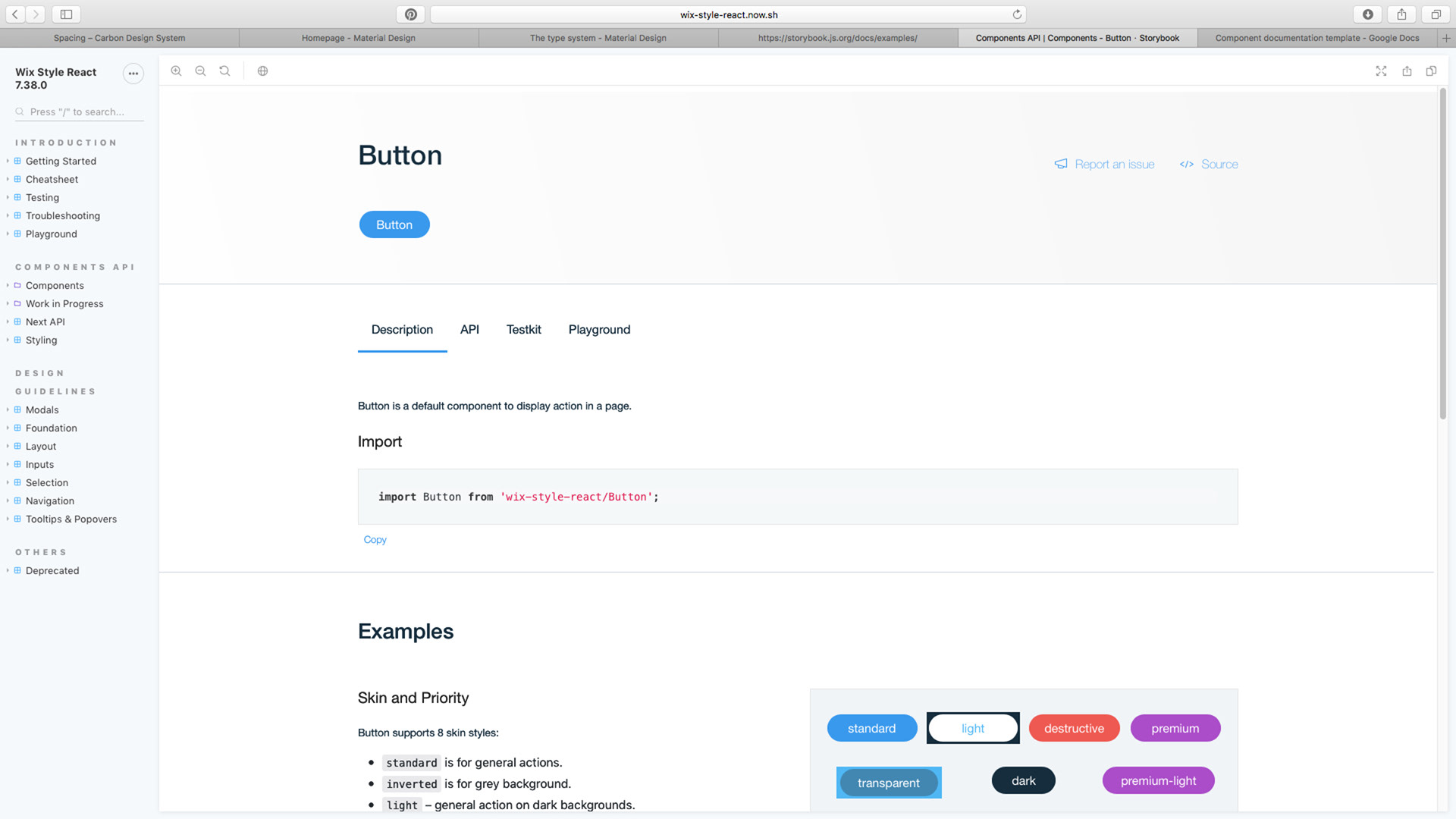
Buttons
• Description
• Import
• Examples (Visual & Code)
• Skin & Priority
• Size
• Affix
• States
• Custom HTML Tag
• Import
• Examples (Visual & Code)
• Skin & Priority
• Size
• Affix
• States
• Custom HTML Tag
• API
• Testkit
• Playground
• Testkit
• Playground
Template Structure
Ideation
Structure & Scope
The specific parts of the design system outline its structure and scope. These sections typically provide guidelines for how design elements should be used and organized within a project or organization.
+ Introduction *Context
+ Getting Started
+ Cheat Sheet *Design Language
+ Troubleshooting
+ Playground
+ Getting Started
+ Cheat Sheet *Design Language
+ Troubleshooting
+ Playground
Design Guidelines
+ Design Principles
+ Brand Guidelines
+ User Experience
+ Tone of Voice
+ FAQs
+ Design Principles
+ Brand Guidelines
+ User Experience
+ Tone of Voice
+ FAQs
Icons
+ Iconography
+ Iconography
Style
• Typography
• Spacing
• Colors
• Typography
• Spacing
• Colors
Components
• Buttons
• Dialogs
• Error Messages
• Floating Bar
• Header Bar
• Modals
• Navigations
• Page Header
• Pagination
• Popovers
• Tables
• Tabs
• Tags
• Text Fields
• Time Pickers
• Tooltips
• Selects
• Stepper
• Toast Messages
• Buttons
• Dialogs
• Error Messages
• Floating Bar
• Header Bar
• Modals
• Navigations
• Page Header
• Pagination
• Popovers
• Tables
• Tabs
• Tags
• Text Fields
• Time Pickers
• Tooltips
• Selects
• Stepper
• Toast Messages
Users (Personas)
• UX
• UI
• FE
• UX
• UI
• FE
Out of Scope
• Dashboard Section
• Widgets
• Charts
• Charts Filters
• Charts Legend
• Dashboard Section
• Widgets
• Charts
• Charts Filters
• Charts Legend
Template: Index
Template: Welcome

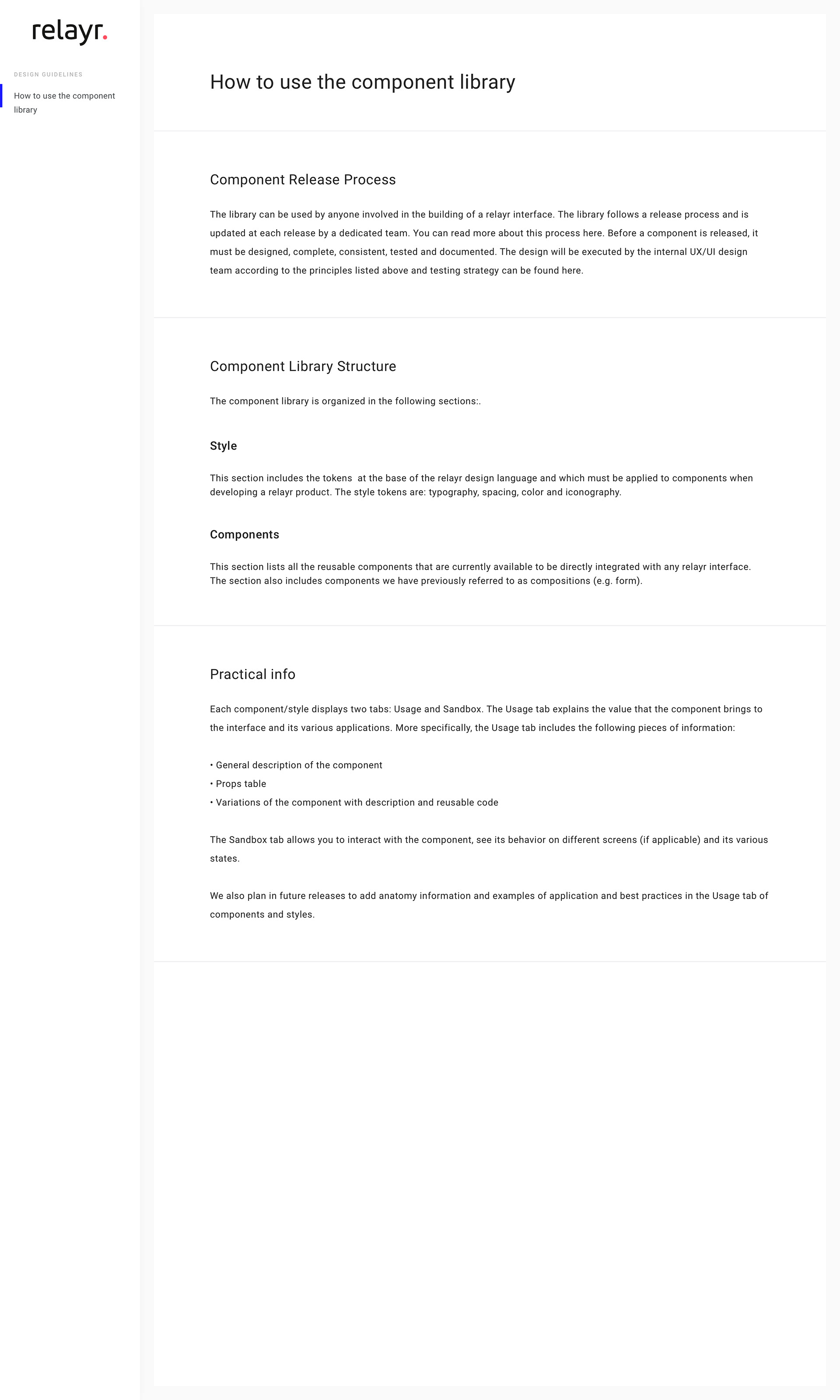
Template: How to use the component library
Template: Design Principles


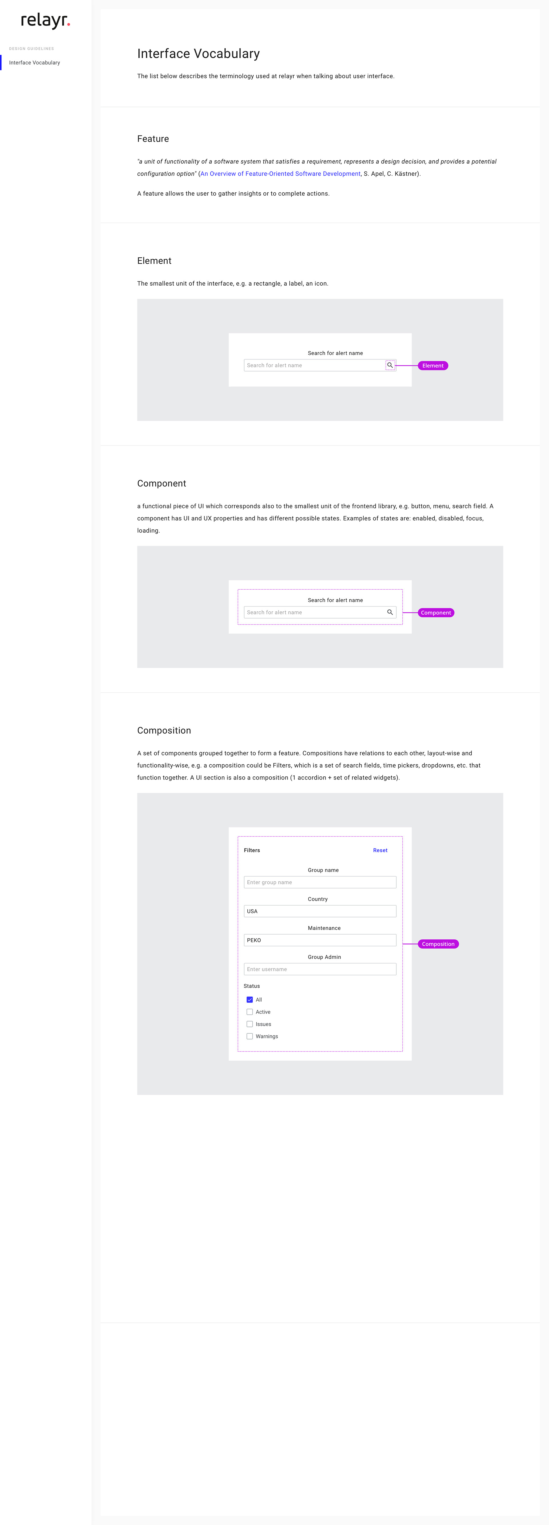
Template: Interface Vocabulary
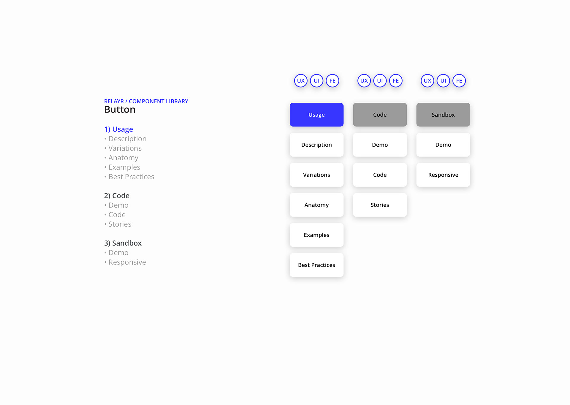
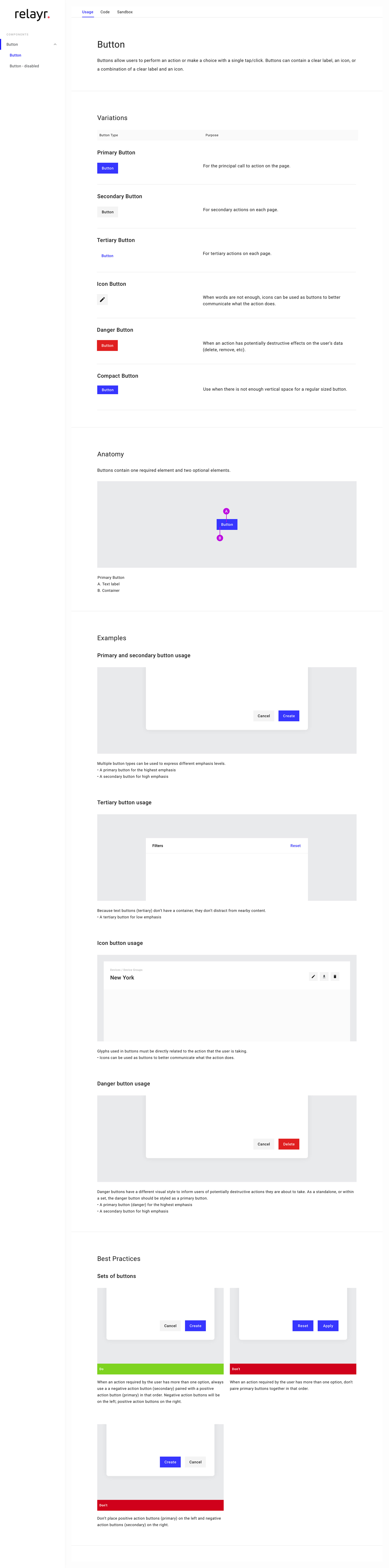
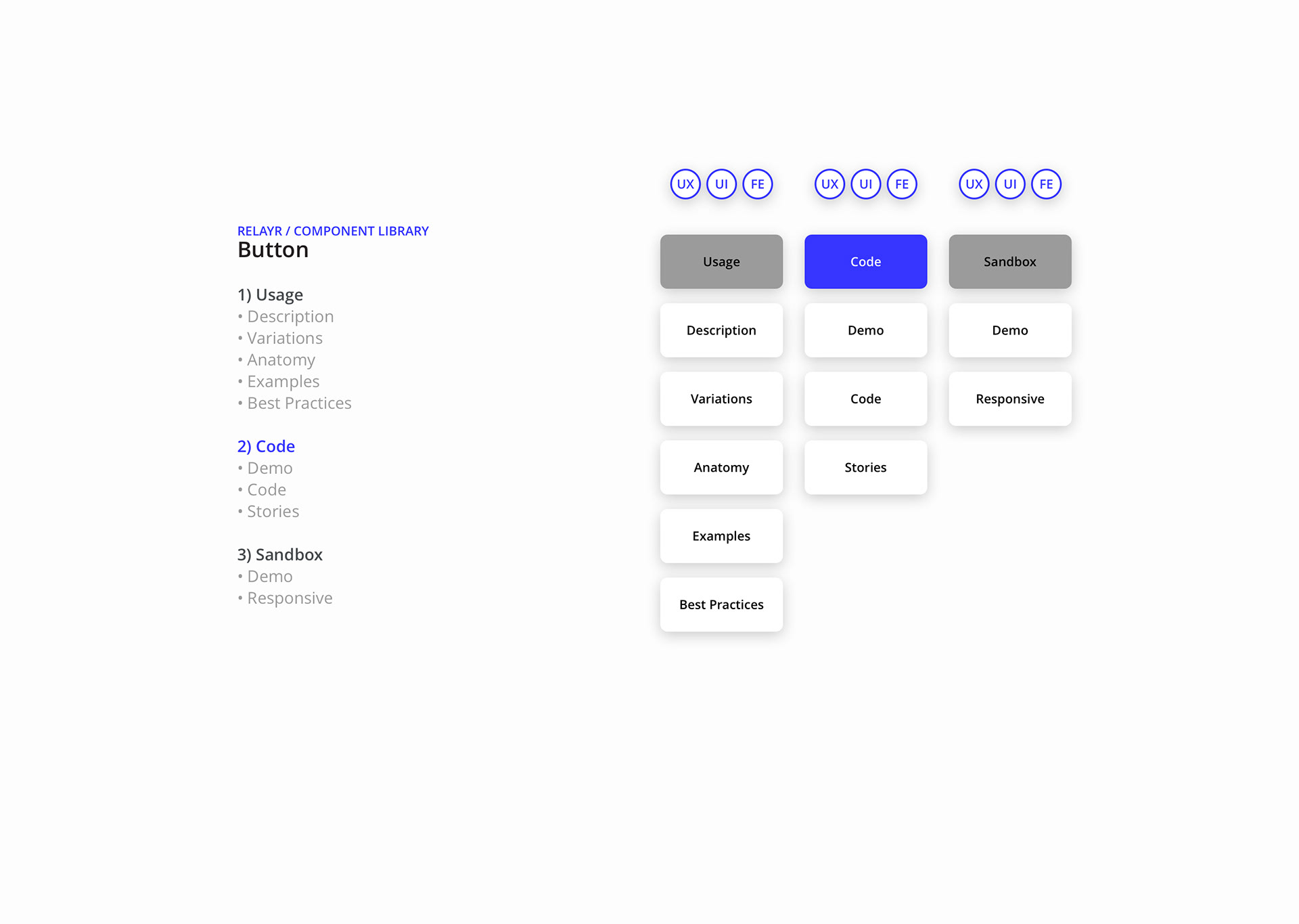
Template: Component Library (e.g. Button)


